
Abstract
Service delivery organizations cater similar processes across several clients. Process variants may manifest due to the differences in the nature of clients, heterogeneity in the type of cases, etc. The organization’s operational Key Performance Indices (KPIs) across these variants may vary, e.g., KPIs for some variants may be better than others. There is a need to gain insights for such variance in performance and seek opportunities to learn from well performing process variants (e.g., to establish best practices and standardization of processes) and leverage these learnings/insights on non-performing ones. In this paper, we present an approach to analyze two or more process variants, presented as annotated process maps. Our approach identifies and reasons the key differences, manifested in both the control-flow (e.g., frequent paths) and performance (e.g., flow time, activity execution times, etc.) perspectives, among these variants. The fragments within process variants where the key differences manifest are targets for process redesign and re-engineering. The proposed approach has been implemented as a plug-in in the process mining framework, ProM, and applied on real-life case studies.
You have full access to this open access chapter, Download conference paper PDF
1 Introduction
Services organizations cater to a large number of clients on a daily basis. Service providers typically implement/deploy a service delivery framework to meet Service Level Agreements (SLAs) and closely monitor the performance and efficiency of their operations to meet stringent compliance requirements, handle cost pressures, inefficient processes and complex workflows. Subtleties specific to clients, heterogeneity in types of cases, etc. lead to process variants. For example, the way how a particular process (e.g., claims processing) is handled for different clients (different insurance providers) lead to process variants; in large organizations due to a lack of standardization, process variations may arise as a result of, e.g., different teams handling the same process in different ways; in a loan application process, there could be different pathways followed depending on the type of customer (e.g., gold, platinum, etc.); in an issue management process, process variations might manifest depending on the type of issue.
The operational Key Performance Indices (KPIs) may vary across such process variants. For instance, two clients requiring a similar process (e.g., document verification) to be executed, may incur very different turnaround times for process completion. In some cases, this can even result in the service provider meeting SLA specifications for some variants, and violating those of others, despite the similarity in processes executed. There is a need to gain insights for such variance in performance and seek opportunities to learn from well performing process variants and leverage these learnings/insights on non-performing variants (e.g., establish best practices, standardization of processes, etc.). An important step towards this is to identify key differences that manifest among the process variants. Variants of a business process may be different in several perspectives, such as control-flow and time. For example, in the time perspective, the execution/flow time of activities/transitions across the variants may differ, in the control-flow perspective, the paths of the process flows that are most often executed may differ.
In this paper, we propose an approach for analyzing two or more process variants to identify key differences among them. Our approach addresses not just structural differences between the variants but also considers rich qualitative information such as the frequencies and flow times (provided as annotations) pertaining to the execution of processes. We present metrics and measures to identify significant differences, detect cascaded components (due to the propagation of differences manifested at a source), and identify most aberrant processes among the variants. The proposed approach has been implemented as a plug-in in the ProM frameworkFootnote 1 and tested on several real-life case studies. Our experiments reveal that this approach is able to uncover useful insights on where and how processes differ. Such insights are helpful to further explore and identify the reasons for such aberrations (understand the why’s).
The rest of the paper is organized as follows: Related work is presented in Sect. 2. Section 3 discusses some metrics that could be used to enrich process models. Our framework for analyzing process variants is presented in Sect. 4. Section 5 discusses the implementation of the proposed approach as a ProM plug-in. Section 6 presents and discusses some experimental results. Finally, Sect. 7 concludes the paper.
2 Related Work
There has been some prior work in identifying the similarities in process graphs [4, 6, 10, 13]. [6] presents metrics to identify the key similarities between two process graphs based on presence, absence, or changes in nodes and edges in the graphs while [4] discusses techniques to identify semantic equality between process graphs when the names of the activities among processes are not provided correctly. [13] presents fast classification of process models into relevant, irrelevant, and potentially relevant, as a way to quickly identify similarities in different business processes. The aforementioned papers fail to account for the attributes/annotations of the edges in a process model. In this work, we identify the differences in the transitions (i.e., edges) in processes apart from the activities (i.e., nodes).
Structural differences among process graphs have been studied in [2, 7, 8, 12]. While [2] uses graph distance metrics based on whether or not an edge is present between two process dependency graphs, [8] uses spectral graph analysis to detect structural changes. However, these do not consider the qualitative differences based on attributes of the nodes and/or edges in process graphs.
Differences between process variants considering attributes of nodes/edges were studied in [3, 5]. [5] detects only categorical differences among attribute values i.e., it only indicates whether there is an increase/decrease/no change in attribute values but doesn’t quantify the magnitude of differences. In contrast, in this paper, we quantify the magnitude of differences. [3] uncovers statistically significant differences between two process models represented as transition systems. The statistical significance of the difference is computed using Welch’s two sided T-test, which assumes that the two distributions are normal. However, this assumption may not hold true in many real-life circumstances. In fact, most of the transition time annotations in the processes we have studied are observed to have non-normal distributions. In this paper, we propose a much robust difference metric using Wasserstein distance [11] based on cumulative distribution functions. Furthermore, our approach enables the analysis of multiple (more than two) process variants and also detects cascading effects in the differences.
Table 1 summarizes the result of our comparative analysis. We can see that our proposed work extends the state-of-the-art with capabilities missing in those. We evaluated the various plug-ins/tools available for process comparison on their functional and non-functional aspects. On the functional side, we checked for
-
nature of differences: whether the tool supports the detection of structural and/or quantitative annotation differences
-
diagnostic insights: the ability to provide diagnostic insights through interactive visualization (e.g., upon clicking on an element of the model)
-
scalability: the ability to compare more than two variants
-
cascaded components: the ability to detect cascaded components, i.e., propagation of differences (cf., Sect. 4)
-
flexibility: the ability to support multiple distance measures, handle different types of annotations (e.g., scalar values, distributions, etc.)
On the non-functional side, we looked at the ease-of-use. We evaluated these tools on the basis of usability and interpretability of the outputs. In particular, we looked for interactive visualizations, drill downs and textual descriptions for the identified differences for easy consumption by the user.
3 Process Annotation Metrics
Variants of a process can manifest themselves across several different perspectives, e.g., control-flow, performance, data, resource, etc. Process models can be enriched with rich information (as annotations) to provide deep insights. Such enriched process models can be viewed as process maps, analogous to cartographic maps. With effective visualization, process map can provide multiple seamless views of a process highlighting several facets w.r.t process executions, e.g., highway paths followed in a process, bottleneck flows, etc. In this section, we introduce some measures (metrics) that could be used as annotations in process maps.
Given a process model, frequency and time of execution are two measures that provide insightful information on the control-flow and performance perspectives of the process.
-
Frequency is a control-flow measure that captures the number of times a node/edge of process map is traversed (visited) during the execution of process instances.
-
Time is a performance measure that captures the amount of time spent during the execution of process instances. Different notions of time can be captured, e.g., execution time (of an activity), turnaround time (of an activity and process instance), flow time (between two activities), etc.

Deriving metrics and annotating process maps by replaying event logs on process models.
If event logs capturing process executions are available, one can use replay techniques [1] to accumulate such metrics and use them for generating process maps as illustrated in Fig. 1. In case event logs are not available, we expect the process owners to provide these metrics (e.g., expected flow time).
Depending on the richness of process execution data and process model specification, some or several of these metrics can be computed. For example, if the event log captures the various life cycle stages of an activity (e.g., start, suspend, resume, complete, etc.), one can compute the execution time, turnaround time, waiting time, etc. If the process model specification also captures the life cycle stages of an activity (e.g., a flow from activity-start to activity-suspend, activity-suspend to activity-resume, etc.), several of the primitive time metrics can be captured as flow-time of edges (flows) in the process.
We consider three variants of the frequency measure
-
absolute frequency: is the absolute value of the number of times a node/edge is traversed/visited during process executions.
-
trace frequency: is the number of process instances (or traces) that visited a node/edge. Multiple visits of a node/edge within a process instance are ignored here.
-
normalized trace frequency: is the fraction of process instances that visited a node/edge. This is helpful if the metrics are derived from event logs. This metric normalizes the differences in the number of process instances among the process executions of the variants.

Issue management process and its annotated versions.
Figure 2(a) depicts an issue management process with no annotations. Figure 2(b) depicts the issue management process map annotated with frequency measures. For each node/edge, there are two measures, the absolute frequency and trace frequency (enclosed in parenthesis). For example, the number of instances of execution of In Progress is 146 and these are manifested in 137 traces. It must be noted that the absolute frequency and the trace frequency for a node/edge will differ when it is visited multiple times due to the presence of a cycle/loop in a process instance. The absolute frequency of that node/edge will be the number of times it was visited in all the process instances. But the trace frequency will only count the number of process instances (or traces) in which the node/edge was present.
We consider two variants of the time measure
-
distributions: capture the actual execution/flow time of all instances of a node/edge in the process executions.
-
scalars: sometimes, comparing derived metrics for the distributions may provide useful insights. Examples of scalar metrics for time are average time, minimum time and maximum time. The average time captures the average execution/flow time of a node/edge of a process. If this is computed from the event log, this corresponds to the average of the flow/execution time of all instances of the node/edge manifested in the process executions. If this is to be provided by a process owner, this can correspond to the expected execution/flow time. The minimum time corresponds to the minimum flow/execution time of all the manifestations of a node/edge in the process maps. Comparing minimum times can provide useful insights to the process owner at times. For instance, a node/edge in a process variant having twice the minimum time than the same node/edge in another variant of the process could suggest an improvement that could be made in the first variant.
Figure 2(c) depicts the issue management process map enriched with average flow time measure on the edges. For example, the average flow time between In Progress and Waiting UAT Deployment is 129.26 h.
4 Framework to Analyze Process Variants
Given a set of annotated process map variants, our framework for analyzing those variants comprises of five steps as depicted in Fig. 3.

Framework for analyzing process variants.
-
Generate Unified Process Map: To provide a global view of all process map variants, we generate a unified process map that is formed by taking a union of all nodes and edges of the input map variants. In other words, if \(P_1 = (V_1, E_1), P_2 = (V_2, E_2), \dots , P_n = (V_n, E_n)\) are the n process variants, the unified process map \(P_U = (V_U, E_U)\) where \(V_U = \cup _{i=1}^n V_i\) and \(E_U = \cup _{i=1}^n E_i\).
The annotations for the unified map can be derived from the annotations of the input maps. For example, we can choose the minimum, maximum, or the average of the input annotations.
-
Compute Differences: Detecting nodes/edges that are absent in some process maps but present in others is pretty straightforward. For nodes/edges present in all maps but might differ in the annotations, we propose two strategies to compute the differences:
-
unified map differences: here we find the differences of each input map w.r.t the unified map and then take an aggregate of these differences.
-
pair-wise differences: here, we find pair-wise differences between every pair of input maps and then take an aggregate of these differences.
The computation of difference between two maps depends on the nature of the annotation in the maps’ nodes/edges. We suggest three different distance measures
-
absolute difference of an annotation is defined as the magnitude (absolute value) of the difference between the annotation values of the two maps. This measure is applicable when the annotation values are numeric and normalized, e.g., as in normalized trace frequency.
-
relative difference of an annotation is defined as the relative change in the values of the annotation in the two maps. Here, we choose one map as a reference.
$$ \mathrm {rel_{diff}} (v_i, v_j) = \frac{\vert v_i - v_j \vert }{v_{\mathrm {ref}}} $$where \(v_{\mathrm {ref}}\) is the annotation value of the reference map.
However, using this definition makes \(\mathrm {rel_{diff}} (v_i, v_j)\) asymmetric depending on the choice of reference. If the reference map is the unified process map, then the denominator is always the same (that of the unified process map). However, for pair-wise differences, we can take either of the maps as reference. In order to make it symmetric, we use the same strategy that is used to make the KL-Divergence symmetric [9], which is:
$$ \mathrm {rel_{diff}} (v_i, v_j) = \frac{1}{2}\frac{\vert v_i - v_j \vert }{v_i} + \frac{1}{2} \frac{\vert v_i - v_j \vert }{v_j} $$i.e., we consider the relative difference taking both the input values as a reference and then average the differences.
This measure is applicable when the annotation values are numeric but not normalized, e.g., as in average flow time. In non-normalized annotations, the magnitude of the difference will not be informative. For example, the absolute difference of flow time between 1000 ms and 1002 ms and between 1 ms and 3 ms is the same. However, the latter difference might be significant than the former.
-
statistical difference of an annotation is defined over those annotations that contain collections of values, e.g., flow time distributions. For such annotations, we propose the use of Wasserstein distance based on cumulative distribution functions (CDFs) as a distance measure, which is defined as
$$ d_\mathrm {Wasserstein}(V_1, V_2) = \int _{k=-\infty }^{\infty } \vert \mathbb {P}(x \le k) - \mathbb {P}(y \le k)\vert $$where x and y are random variables representing the two distributions \(V_1\) and \(V_2\) respectively. \(\mathbb {P}(x \le k)\) is the fraction of elements in x that are less than or equal to k.
Intuitively, Wasserstein distance measures the difference in the areas of the CDFs. Figure 4(a) depicts CDFs for two populations and Fig. 4(b) depicts the Wasserstein’s distance, which is captured as the difference in areas between the two cdfs (shaded region).
Fig. 4. 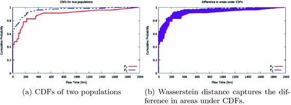
Illustration of Wasserstein’s distance.
-
-
Generate Difference Process Map: The difference process map is a unified process map annotated with the differences computed for the nodes and edges. As discussed above, the differences among the input process maps can be computed either with the unified graph annotations or using pair-wise differences.
-
Compute Cascaded Components: Control-flow differences between process maps due to a change at a single node (e.g., being executed more/less often) in a process map variant may cause a set of related nodes to also have significant differences w.r.t. frequency measure. Identifying such fragments is interesting to a business user for root-cause analysis. We discover such cascaded effects by identifying connected components in the difference map. The basic idea in detecting cascading components is as follows. First, we identify the nodes/edges that have significant differences. Then in each process map, we consider only that view of the process map involving the nodes/edges with significant differences. For each such component, we extract those nodes/edges that have a similar annotation value as compared to the node/edge under consideration, i.e., the relative difference is below a threshold. The extracted nodes/edges are considered to be in the same cascaded fragment. The fragments containing both the components are then merged to obtain a bigger connected component of cascaded differences. The process is repeated for each node/edge in the view until no other connected component can be formed.
-
Visualize: The unified and difference process maps are to be presented to the user in an interactive and intuitive visualization. We use color and thickness properties of graph visualization to represent the intensity of an annotation in time and frequency respectively. For the time-based annotations, we divide the range of annotation values into bins and represent them in a color spectrum ranging from green to red (with red indicating most significant value in time). For example, a red edge indicates bottleneck flow in a unified process map while it indicates the flow with the most significant difference in flow time (among process variants) in a difference map. Using four quartiles, we can color the flows in green, yellow, orange, and red. Nodes/edges that are absent in some and present in others are shown in blue color.
Similarly, the thickness of nodes/edges can be used to signify annotations related to frequency. Thick edges signify the most frequent flows (highways) in a unified process map and flows with significant differences in a difference process map respectively. Nodes/edges that do not have significant differences w.r.t frequency or time are grayed out (made invisible) while cascaded components are displayed using filled nodes.
In addition, we can provide insightful information upon drill-down on an edge/node. For example, upon clicking on an edge in a difference map, we can show the pair-wise differences of the edge’s annotation (e.g., flow time) w.r.t the input process maps.

Detecting the Most Aberrant Process Map
Given a set of process maps, an interesting question is to find the process map that is most aberrant from the rest. Using the pair-wise difference matrix, we can rank the maps according to their contribution of differences w.r.t other maps by sorting the rows/columns according to the sum of values in each row/column. We can then answer questions such as what are the top k process maps that contribute the maximum to the differences or the process maps that contribute to p percentage of differences.
5 Implementation
The proposed framework has been implemented as a plug-in in ProM. Although our framework is generic and can be applied to process models represented in any formalism, in this implementation, we use Heuristic nets as base process models and annotate them with metrics discussed in Sect. 3. We have adapted the Heuristics miner plug-in to compute these metrics. Heuristic models are annotated with these metrics to generate Heuristic maps. Given process variants as multiple Heuristics maps, the plug-in implements the framework discussed in Sect. 4 to analyze these variants and presents the results in an interactive visualization. We can drill down into the components (nodes/edges) identified as significantly different to gain further insights into how the variants are different.

Process models discovered using heuristic nets miner and annotated with frequency, trace frequency, and average flow time metrics.
6 Experiments and Discussion
In this section, we discuss the results of applying the proposed framework on the event logs pertaining to an issue management process in the customer care division within a large service delivery organization. The organization is interested in analyzing the differences in product development issue management process when handling different types of products. The product development issue management process at a very high-level involves the movement of cases from backlog to in progress. Subsequently, some cases can be completed while some can be sent for user acceptance tests and then are deployed live. Cases can be abandoned at any point in time. We considered the event logs from this product issue management process related to three different products \(P_1\), \(P_2\), and \(P_3\) to analyze how these variants differ. The characteristics of these logs are depicted in Table 2. Figure 5 depicts the process maps obtained by using the heuristics miner. The heuristics nets are annotated with the frequency, trace frequency, and average flow time metrics. The numbers in parenthesis at each node/edge correspond to the trace frequency of that node/edge.

Screenshot of the output of the plug-in showing the difference process map and pair-wise differences between the variants both in frequency and time.
Figure 6 depicts a screenshot of the plug-in’s output highlighting the difference process map and the summary of pair-wise differences between the input variants both for frequency (bottom-left diagonal matrix) and time (bottom-right). From the figure, we can see that variant \(P_1\) is the most aberrant model w.r.t the frequency and variant \(P_3\) is the one w.r.t time. Let us discuss the interpretation of these differences in detail.

Unified and difference process maps of the three process variants \(P_1\), \(P_2\) and \(P_3\).
Figure 7(a) and (b) depict the unified process map and the difference process map for the three process variants. The unified graph is annotated with the maximum normalized trace frequency for the frequency measure and average flow time for the time measure w.r.t the process variants. For example, the normalized trace frequency metric for the node Waiting UAT Deployment is 0.75, which is the maximum among the normalized trace frequencies 0.16, 0.31 and 0.75 for the three process variants. Similarly, the flow time from In Progress to Waiting UAT Deployment is 130.53 h, which is the average of the flow times 129.26, 33.15, and 229.19 h.
The difference graph (Fig. 7(b)) is annotated with the average differences of each node/edge w.r.t the unified graph for both the frequency and time (the frequency differences are annotated with the label ‘f’ and time differences with ‘t’). Nodes/flows that are absent in some input variants but present in others are drawn in blue. Table 3 depicts such flows along with the variants where they manifest and where they do not. Nodes/flows that do not exhibit significant differences are made invisible (grayed out). For example, the nodes Start, Backlog and In Progress and the flows between them are all greyed out because, no significant difference exists between them both in frequency and time.

Diagnostic information on the frequency difference of the flow In Progress to Done.
Figure 8 depicts the diagnostic information on the uncovered significant difference w.r.t frequency for the flow In Progress to Done. Detailed information on the differences is provided by the plug-in upon clicking any edge/node. The normalized trace frequency for this flow across the three variants are 0.81, 0.16, and 0.32 respectively, i.e., \(81\%\) of the issues in \(P_1\) takes the route to Done after In Progress is performed while only \(16\%\) and \(32\%\) of the cases take that route in \(P_2\) and \(P_3\). Clearly, \(P_1\) behaves distinctly when compared to \(P_2\) and \(P_3\), which is reflected in the pair-wise difference matrix in Fig. 8 as the most aberrant process. Figure 10 depicts the diagnostic information on the uncovered significant difference w.r.t time for the flow In Progress to Waiting UAT Deployment. Table 4 depicts the flow time values of this flow across the three variants while Fig. 9 depicts the cumulative distribution functions (CDFs) of the sets of time values for the three variants. Clearly, we can see that the cdf of \(P_3\) is much distinct from that of \(P_1\) and \(P_2\). This is also reflected in the average and standard deviation values of \(P_3\), which is much larger than that of \(P_1\) and \(P_2\). As discussed in Sect. 4, we use the Wasserstein distance to quantify the difference between the time distributions. The pair-wise differences between the variants on this particular flow is shown in Fig. 10. We can see that \(P_3\) is reflected as the most aberrant process.

Cumulative distribution functions for the different variants.

Diagnostic information on the time difference of the flow In Progress to Waiting UAT Deployment.
Furthermore, the difference process map highlights the cascaded component, Waiting UAT Deployment, Waiting Acceptance, Waiting Live Deployment and Live (Ref. Figure 7(b)). As discussed earlier, process \(P_1\) exhibits distinct behavior in the flow In Progress to Waiting UAT Deployment (\(81\%\) of traces in \(P_1\) take that flow as against \(16\%\) and \(32\%\) in the other two variants). Because of this, the subsequent flows in \(P_1\) after Waiting UAT Deployment also exhibit a significant difference. Apart from identifying the individual differences, it is insightful to identify the root-cause of the propagation of the change. Using the detection of cascaded components, we are able to identify the root-cause in this context to be the node Waiting UAT Deployment.
7 Conclusions
Analyzing variants of process execution provides valuable insights on where the variants differ. Such elements are potential candidates for process re-engineering/redesign efforts. One can try to learn from better performing variants and adopt them to others. In this paper, we presented an approach to analyze two or more process variants to identify nodes/flows where key differences manifest along the control-flow and time dimensions. The results of our experiments show that our approach is capable of providing insights at various levels that cannot otherwise be derived with existing tools as easily. While the present paper addresses the where and how aspects (where variants differ and how they differ), as future work, we would like to focus on alluding root-causes for such aberrations, i.e., address the why’s [1].
Notes
- 1.
See www.processmining.org for more information and to download ProM.
References
Van der Aalst, W., Adriansyah, A., van Dongen, B.: Replaying history on process models for conformance checking and performance analysis. Wiley Interdisc. Rev.: Data Mining Knowl. Discov. 2(2), 182–192 (2012)
Bae, J., Liu, L., Caverlee, J., Zhang, L.J., Bae, H.: Development of distance measures for process mining, discovery, and integration. Int. J. Web Serv. Res. 4(4), 1 (2007)
Bolt, A., de Leoni, M., van der Aalst, W.M.P.: A visual approach to spot statistically-significant differences in event logs based on process metrics. In: Nurcan, S., Soffer, P., Bajec, M., Eder, J. (eds.) CAiSE 2016. LNCS, vol. 9694, pp. 151–166. Springer, Cham (2016). doi:10.1007/978-3-319-39696-5_10
Dijkman, R., Dumas, M., Van Dongen, B., Käärik, R., Mendling, J.: Similarity of business process models: metrics and evaluation. Inf. Syst. 36(2), 498–516 (2011)
Kriglstein, S., Wallner, G., Rinderle-Ma, S.: A visualization approach for difference analysis of process models and instance traffic. In: Daniel, F., Wang, J., Weber, B. (eds.) BPM 2013. LNCS, vol. 8094, pp. 219–226. Springer, Heidelberg (2013). doi:10.1007/978-3-642-40176-3_18
Kunze, M., Weske, M.: Metric trees for efficient similarity search in large process model repositories. In: Muehlen, M., Su, J. (eds.) BPM 2010. LNBIP, vol. 66, pp. 535–546. Springer, Heidelberg (2011). doi:10.1007/978-3-642-20511-8_49
Küster, J.M., Gerth, C., Förster, A., Engels, G.: Detecting and resolving process model differences in the absence of a change log. In: Dumas, M., Reichert, M., Shan, M.-C. (eds.) BPM 2008. LNCS, vol. 5240, pp. 244–260. Springer, Heidelberg (2008). doi:10.1007/978-3-540-85758-7_19
Lakshmanan, G.T., Keyser, P.T., Duan, S.: Detecting changes in a semi-structured business process through spectral graph analysis. In: Workshops Proceedings of the 27th International Conference on Data Engineering, ICDE, pp. 255–260 (2011)
Manning, C.D., Schütze, H.: Foundations of Statistical Natural Language Processing, vol. 999. MIT Press, Cambridge (1999)
Montani, S., Leonardi, G., Quaglini, S., Cavallini, A., Micieli, G.: A knowledge-intensive approach to process similarity calculation. Expert Syst. Appl. 42(9), 4207–4215 (2015)
Vallender, S.: Calculation of the Wasserstein distance between probability distributions on the line. Theory Prob. Appl. 18(4), 784–786 (1974)
Weidlich, M., Mendling, J., Weske, M.: Propagating changes between aligned process models. J. Syst. Softw. 85(8), 1885–1898 (2012)
Yan, Z., Dijkman, R., Grefen, P.: Fast business process similarity search with feature-based similarity estimation. In: Meersman, R., Dillon, T., Herrero, P. (eds.) OTM 2010. LNCS, vol. 6426, pp. 60–77. Springer, Heidelberg (2010). doi:10.1007/978-3-642-16934-2_8
Author information
Authors and Affiliations
Corresponding author
Editor information
Editors and Affiliations
Rights and permissions
Copyright information
© 2017 Springer International Publishing AG
About this paper
Cite this paper
Ballambettu, N.P., Suresh, M.A., Bose, R.P.J.C. (2017). Analyzing Process Variants to Understand Differences in Key Performance Indices. In: Dubois, E., Pohl, K. (eds) Advanced Information Systems Engineering. CAiSE 2017. Lecture Notes in Computer Science(), vol 10253. Springer, Cham. https://doi.org/10.1007/978-3-319-59536-8_19
Download citation
DOI: https://doi.org/10.1007/978-3-319-59536-8_19
Published:
Publisher Name: Springer, Cham
Print ISBN: 978-3-319-59535-1
Online ISBN: 978-3-319-59536-8
eBook Packages: Computer ScienceComputer Science (R0)