
Abstract
Affordance has been well discuss in HCI field since Gibson created this concept. Based on Kaptelinin and Nardi’s notion of instrumental affordance, we explore the influence of emotional attributes of effecter affordance on user experience, according to the data of experiment, we argue that (1) the effecter affordances have emotional attributes (e.g. Positive, negative, neutral) that can be pick up by user and impact user experiences. (2) Positive effecter affordance can provide emotional superiority to user experience. We propose several design guidelines according the result of experiment, we hope these principles can help designer avoid mistake and back those good designs up.
1 Introduction
The concept of affordances was created by Gibson. He argue that animal can naturally pick up the “action possibilities” latent in the environment. Then his student Don Norman introduce this term into HCI scope. With the development of this concept, Kaptelinin and Nardi improved Gibson’s original idea; they think there are two aspects affordances of an instrument: handling affordances and effecter affordances. Then Grünbaum and Simonsen found several interactive design guidelines and they think effecter affordances need not be directly perceivable to the user.
The aim of this paper is to explore more in this filed, we believed that the effecter affordances have Emotional Attributes (e.g. Positive, negative, neutral); we believe that it can be pick up by user and impact user experiences.
2 Related Works
The concept of Affordances were created by Gibson, J. J. in his 1977 article “The Theory of Affordances” and explored it more fully in his book The Ecological Approach to Visual Perception in 1979 [1, 2]. Gibson use this term to explain the correspondence between physical properties of nature and animals. He propose the idea that affordances of an object can be directly pick up by animals. Yet most objects have multiple usages, choose which one is depend on the subject’s psychological state.
Norman applied the term “affordances” to HCI and industrial design disciplines. He argue that affordances result from the mental interpretation of things, it was based on our past knowledge, experience, and applied to our perception of things about us [3]. Then he realize that the term has been widely used and misused, so he clarify that he would like to replacing all instances of the word “affordances” with the phrase “perceived affordances.” He separates “real” affordances (the physical properties of the world) from ‘perceived’ affordances (subjective representations in the mind), and is more concerned with the perceptual properties of affordances rather than the actual properties of the objects themselves [4]. He propose that the most important thing is let people understand the product or service, give them sign of what it is for, and what the alternative actions are [5].
Gaver introduce Gibson’s affordances into HCI field with a different way then Norman dose [6]. He state that affordances can be group in space (nested affordances). An affordance can be nest into a father affordances, and contain a sublevel affordances. For instance, the affordances of pulling the handle is nest within an affordance of opening the door. He also propose that affordances are independent of perception. They exist whether the perceiver cares about them or not, whether they perceived or not. Distinguishing affordances from perceptual information about them is useful in understanding ease of use.
Kaptelinin and Nardi argue that the concept of affordances has a number of fundamental inherent limitations and cannot be directly extended to HCI field. They create technology affordances to serve the needs of HCI research and practice [7]. When people interact with an instrument through technology, they consider the technology as a mediational means. The affordances provided by an instrument comprise two aspects: handling affordances, possibilities for interacting with the technology; effecter affordances, possibilities for employing the technology to make an effect on an object.
Grünbaum and Simonsen work based on instrumental affordances, they investigate what it means to break an affordance, and propose several design principles, they argue that there is largely unexplored design space for designing, and redesigning objects with broken affordances [8].
From above we know that there is a great deal of debate of affordance. But the most important things is when we talk about affordances in HCI field, we should ignore the affordances of screens, and focus on the affordances of interface, or we can use Gaver’s theory to explain: the affordance of interface is nested into a father affordance. Grünbaum and Simonsen argue that effecter affordances need not be directly perceivable to the user in their paper “the affordances of broken affordances”. But this point make me confused, there are many examples in our life indicate that effecter affordances need be perceivable to user, for instant, the bottom use warning color (e.g. red, yellow) if the consequence of press is important. The reason why it design in this way is to indicate the user that they should think twice before they press the bottom or highlight the important bottom to the user.
3 The Problem of Effecter Affordances
Here is another example that proved effecter affordances can influence user’s action. When I work as an intern in one of biggest internet company in China, Baidu, I have an interesting finding while I follow up on a project.
Three are three different version of login page shown in Fig. 1. (The interface in Fig. 1 has been revised, but the thing is same) The color and the sentence both influence the conversion rate (The conversion rate here is the proportion of visitors that successfully login with Facebook account and all of the visitors that arrive this login page). The conversion rate rise about 3.8% after the bottom’s color change into standard Facebook blue (B), and it rise another 4.2% after the sentence has been add above the login bottom (C), the sentence tell user that their privacy will never leak form this app. 4.2% is really a huge number when your app have hundreds of millions of users.

Three different version of login page
Effecter affordances can activate the low-level mental reflection of user; people might fell unsafety about their privacy through the perceptual information like color, sentence or any other elements in this interface (A). It is because the elements in this page bring positive effecter affordances to user, make they feel more safety when login with Facebook account and lead to the conversion rate raised.
The aim of this paper is to improve Grünbaum and Simonsen’s work, we argue that the emotional attributes of effecter affordances have correspondence with user experience, positive effecter affordances can improve user experience, and vice versa.
This example also inspire us that the intensity of handling affordance may influence people’s action too. The intensity here is the degree of similarity between object’s usage and user’s mental interpretation. For instance, two objects (a, b) that both can afford the possible of sit down, A has an appropriate height to sit, but B’s height is too short to sit. The possibility that people choose to sit on A is higher than B. Therefore, we said the intensity of handling affordance of A is higher than B. We believe this theory can apply to interface design. We believe that there is largely unexplored research space, but in this paper we focus on effecter affordance and user experience.
4 Experiment – The Impact of Emotional Attributes of Affordance to User Experience
The aim of this experiment is find out the correlation between emotional attributes of effecter affordances and user experience. We invite five senior UI designers and five design researchers extract elements from interface. The effecter affordance of those elements must be easy to identify and highly associated with emotion. We got five elements that are color, graphic, disturb elements, font and dynamic effect.
Independent variable are the emotional attributes of effecter affordance of those elements (positive, negative and neutral). Dependent variable are user experience, we use “reliability”, “satisfaction”, “happiness” as emotional experience factors, “usefulness” and “ease of use” as practical experience factors, we stress that the above five factors can be replaced by more refined principles of design. For example, Norman argue that emotional experience contain hedonics, aesthetics and fun/pleasure [9]; Rober Rubinof’s four elements of user experience: Branding, usability, functionality and content. [10] Control variable are operate instrument (iOS 10.1.1), environment, handling affordance (the process of all tasks and touchable area remain invariant), and brand effect (A good brand can delivery reliable feeling to participants).
We use mobile payment flow as experiment material, because:
User can easily distinguish the emotional attributes of result in payment scene. (E.g., this payment page makes me feel safety/unsafety);
After years of development, the basic environment of China’s Mobile Payment had been formed. Mobile payment became one of indispensable tool in people’s life. The data from BigData-Research shown [11], there are 1.8 billion active users of Alipay in 2016 July.
Therefore, we choose payment flow of Alipay as prototype; we define the form of five elements respectively in different kinds of emotional attributes, shown in Table 1. Then we design experiment task according to Table 1 (Fig. 2)

Materials for experiment
In task 5and 6, Natural utilization means the disturb elements (e.g. advertisement) use same visual style as interface dose; Abrupt utilization means the disturb elements use different visual style as interface dose. In task 9, the effect is smooth, elegant and full of detail, but in task 10 there basically has no dynamic effect, the elements abruptly emerge when page change.
Participants are 15 college students aged 18~29, 7 male and 8 female, 5 major in industrial design, 10 major in mechanical engineering, all subjects are familiar operator of iOS, and frequently use mobile payment to pay.
Subjects were asking to transfer 20 yuan through mobile payment interface, the trading password which is easy enough to remember has been told to the participants before experiment, all participants were asking to finish each task through their instinct, subjects need to filled out questionnaire as follow after each task has been finished.
The interface and flow in this task:
-
It is reliable and makes me feel safety (reliability)
-
Makes me feel satisfied (satisfaction)
-
It is funny to use (happiness)
-
Do help me reach my goal (usefulness)
-
It is easy to operate (ease of use)
The questions asks participants choose the closest answer on a 5-point scale (1 = strongly disagree, 5 = strongly agree). The question of questionnaire respectively represent the five factor of user experience. We use SPSS analyze the data of questionnaire.
The data illustrated that:
-
1.
All positive groups (1 3 5 7 9) shows higher user experience than negative groups (2 4 6 8 10); There is significant difference between positive and negative groups on user experience, positive effecter affordance can provide emotional superiority to user experience (Fig. 3).
Fig. 3. 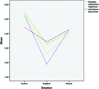
Relationship between emotional attributes of effecter affordance and dependent variables
-
2.
Color: positive group provide much more “reliability” than comparative group, the negative group comes out completely opposite situation. (Figure 4) Both negative and positive group provide more “satisfaction” and “happiness” than comparative group (Figs. 4 and 5), but show no difference with comparative group on “usefulness” and “ease of use” (Figs. 5 and 6).
Fig. 4. 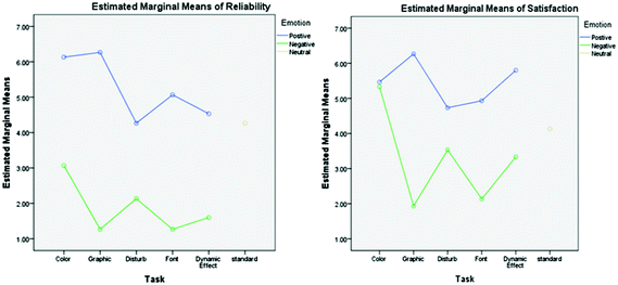
The estimated marginal means of reliability and satisfaction
Fig. 5. 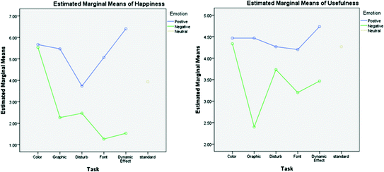
The estimated marginal means of happiness and usefulness
Fig. 6. 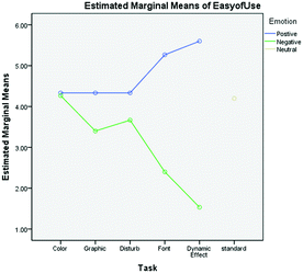
The estimated marginal means of ease of use
Result: Positive EA (effecter affordance) of color can enhance the “reliability”, “satisfaction” and “happiness”, negative color can also improve the “satisfaction” and “happiness”, but it will provide a much lower “reliability”, both positive and negative color show no significant impact on “usefulness” and “ease of use”.
-
3.
Graphic: positive group show much more “reliability”, “satisfaction” and “happiness” than comparative group (Figs. 4 and 5), and provide the highest “reliability” and “satisfaction” among all user experience factors (Fig. 4). Positive groups and comparative group appear to be no difference in the “usefulness” and “ease of us” (Figs. 5 and 6). All user experience factor of negative group show lower score than comparative group.
Result: Positive EA of graphic can enhance the “reliability”, “satisfaction” and “happiness” of interface, especially on “reliability” and “satisfaction”, but it cannot enhance “usefulness” and “ease of us”; Negative graphic will lower all user experience factors.
-
4.
Disturb elements: positive group (natural utilization) only show slightly higher on “satisfaction” than comparative group, negative group (abrupt utilization) provide “reliability” and “happiness” far below those of comparative group.
Result: natural utilize disturb elements (Positive EA) only slightly enhance the satisfaction of interface, but abrupt utilize disturb elements (Negative EA) will strongly lower the “reliability” and “happiness”.
-
5.
Font: Positive group provide higher “reliability”, “satisfaction”, “happiness”, “ease of use” than comparative group, All user experience factor of negative group show lower score than comparative group.
Result: positive EA of Font can enhance all user experience factors except “usefulness”; Negative EA of Font will lower all user experience factors.
-
6.
Dynamic effect: Positive group provide no less of “reliability” than comparative group, but show higher on the rest of user experience factors. All user experience factor of negative group show lower score than comparative group.
Result: positive EA of Dynamic effect can enhance “satisfaction”, “happiness”, “usefulness” and “ease of use”, especially on “satisfaction” and “happiness”. Negative EA of dynamic effect will lower all user experience factors.


5 Goal-Oriented User Study
To investigate mental activity of user while the feedback and effecter affordance of interface was broken. We conducted a small user study concerned with accomplishing four task, participants were asking to talk aloud about their thinking and feeling when finishing the task (Fig. 7).

Materials for user study
-
Task A: Positive effecter affordance, intact feedback: interface provide positive effecter affordance
-
Task B: Positive effecter affordance, defective feedback: interface provide positive effecter affordance, but the result display ‘transfer succeed’ instead of “transfer failed” and vice versa.
-
Task C: Negative effecter affordance, intact feedback: interface provide negative effecter affordance
-
Task D: Negative effecter affordance, defective feedback: interface provide negative effecter affordance, but the result display ‘transfer succeed’ instead of “transfer failed” and vice versa.
According to the records of user’s feeling, we found that:
-
1.
Task A: all subjects feel satisfaction and reliable about this interface.
-
2.
Task B: despite the interface provide positive effecter affordance, several participants still worried about their goal have been reach or not. In this situation, people will feel disappoint, and blame themselves or external factors.
-
3.
Task C: many subjects worried about their goal have been reach or not because their feel unsafety about interface. In this situation, Users will experience a bad emotional experience
-
4.
Task D: most of subjects feel unreliable about interface, and they blame the unreliable of interface instead of themselves.
6 Conclusion
The experiment research, explore the influence of emotional attributes of effecter affordance on user experience, the result of experiment give rise to several design guidelines:
-
1.
Use positive color and graphic, the effecter affordance of positive color and graphic can significantly affect the emotional experience (reliability, satisfaction, happiness), but cannot enhance the practical experience (usefulness, ease of use).
-
2.
Avoid adding disturb elements to interface, if cannot avoid, adding through a natural way will be better. Abrupt adding disturb elements will sharply lower reliability and happiness of interface.
-
3.
Avoid using disorder and different font, the negative effecter affordance of disorder font will bring negative emotional experience, and significantly lower the practical experience.
-
4.
Make dynamic effect smoothly and naturally, avoid abrupt dynamic effect. Fluent dynamic effect can significantly improve the practical experience and happiness of interface.
Positive effecter affordance will working especially in those interface that have an obviously positive or negative result. For example, mobile payment, login, permission of location or other function of mobile. Make sure that provide a positive effecter affordance to user, it is important to those Apps that still in early stage of competition, because competitor’s brand effect has not been established, positive effecter affordance will provide emotional superiority in early stage of competition for your App.
References
Gibson, J.J.: The theory of affordances. In: Shaw, R.E., Bransford, J. (eds.) Perceiving, Acting, and Knowing. Lawrence Erlbaum Associates, Hillsdale (1977)
Gibson, J.J.: The Ecological Approach to Visual Perception. Houghton Mifflin, Boston (1979)
Norman, D.A.: The Psychology of Everyday Things. Basic Books, New York (1988)
Norman, D.A.: Affordance, conventions, and design (2004)
Norman, D.A.: The way I see it: Signifiers, not affordances. Interactions 15(6), 18–19 (2008)
Gaver, W.W.: Technology affordances. In: Proceedings of CHI 1991, pp. 79–84 (1991)
Kaptelinin, V., Nardi, B.: Affordances in HCI: Toward a mediated action perspective. In: Proceedings of CHI 2012, pp. 967–976 (2012)
Grünbaum, M.G., Simonsen, J.G.: The affordances of broken affordances. In: Abascal, J., Barbosa, S., Fetter, M., Gross, T., Palanque, P., Winckler, M. (eds.) INTERACT 2015. LNCS, vol. 9298, pp. 185–202. Springer, Cham (2015). doi:10.1007/978-3-319-22698-9_13
Rubinoff, R.: How to quantify the user experience [OL], 17 February 2009
Norman, D.A.: Emotional Design: Why We Love (or Hate) Everyday Things. Basic Books, New York (2004)
Author information
Authors and Affiliations
Corresponding author
Editor information
Editors and Affiliations
Rights and permissions
Copyright information
© 2017 Springer International Publishing AG
About this paper
Cite this paper
Huang, Z., Jing, Z., Liu, X. (2017). The Emotional Superiority of Effecter Affordances. In: Yamamoto, S. (eds) Human Interface and the Management of Information: Information, Knowledge and Interaction Design. HIMI 2017. Lecture Notes in Computer Science(), vol 10273. Springer, Cham. https://doi.org/10.1007/978-3-319-58521-5_14
Download citation
DOI: https://doi.org/10.1007/978-3-319-58521-5_14
Published:
Publisher Name: Springer, Cham
Print ISBN: 978-3-319-58520-8
Online ISBN: 978-3-319-58521-5
eBook Packages: Computer ScienceComputer Science (R0)