
Abstract
Data interpretation and insights resources are central for real-time decision-making processes. The combination of different representations and visualizations can help users orchestrate their understanding about data and, therefore, provide the conditions and opportunities for insights. Visualization and insights environments provide conditions for users to make real-time decisions by allowing users to “play with data” – interact with different visualizations, perspectives, and level of details. The human-computer interaction (HCI) design strategy for such environments must consider this data “playfulness” necessity, and also other cognitive characteristics related to that kind of environment. HCI inspection methods generate enriched evidences to designers about cognitive characteristics of interaction that are related to usability features and they can also identify usability issues. We selected two well-known usability inspection methods – Cognitive Walkthrough (CW) and Nielsen’s Heuristics (NH) – to perform an evaluation of WISE (Weather InSights Environment). WISE was proposed to improve insightful analysis over weather information, taking full advantage of data. In this work, we discuss the data and knowledge gathered with the comparison of results from CW and NH, and we considered the results from our previous work, which was another HCI evaluation using Cognitive Dimensions of Notations framework (CDNf). Using WISE as a use case, we show and discuss evidences of how a set of specific cognitive characteristics can support HCI evaluation and discussions about the (re)design of visualization and insight environments.
You have full access to this open access chapter, Download conference paper PDF
Keywords
- Human-computer interaction
- Data visualization
- Visualization and insight
- Cognitive characteristics
- Usability evaluation
- Usability
1 Introduction
Data visualization and information presentation are key features of systems that support real-time decision-making processes, facilitated by data interpretation and insights resources [1]. The combination of different representations and visualizations can help users orchestrate their understanding about data and therefore provide the conditions and opportunities for insights [2].
Visualization and insights environments provide conditions for users to make real-time decisions by allowing users to “play with data” – interact with different visualizations, perspectives, and level of details. The human-computer interaction (HCI) design strategy for such environments must consider this data “playfulness” necessity, and other cognitive characteristics related to that kind of environment. Usability is an important feature for those environments and it needs to be carefully defined and adapted to users’ needs regarding data visualization, manipulation, and understanding [3, 4].
The environment evaluated in this work is WISE (Weather InSights Environment), which is a system that gathers and presents weather related information for decision makers. It is a visualization platform that combines data from a weather prediction system with data from a sensor network, presenting them in a web interactive interface. It was proposed to improve insightful analysis over weather information, taking full advantage of data [6]. We selected two well-known usability inspection methods – Cognitive Walkthrough (CW) and Nielsen’s Heuristics (NH) [5] – to perform an evaluation of a visualization and insights environment.
WISE was object of a previous HCI evaluation with the Cognitive Dimensions of Notations framework (CDNf) [7]. With the previous evaluation, we started to identify some cognitive characteristics for WISE in particular. We believe, however, that this might be an interesting path to investigate – and possibly define – usability and cognitive characteristics for visualization and insight environments at large: a set of specific usability and cognitive characteristics for a specific nature of environment or system. In this work, we collected more evidences and insights, regarding usability characteristics and issues for that kind of environment by performing two additional HCI evaluations.
The next sections present and discuss our research in more details. First, we begin by introducing WISE, the visualization and insight environment that we evaluated (Sect. 2). Then, we present a summary of NH and CW (Sect. 3). Next, in Sect. 4, we present the results from both usability evaluations and some discussion about them. Finally, we present some remarks and future work in Sect. 5.
2 Weather InSights Environment (WISE)
Data analysis for sense-making, data analysis, and communication are some of the purposes for data visualization, which is the graphical display of abstract information. It has been focus of previous researches in HCI area, considering not only the organization and presentation of information [1, 3], but also the interactive possibilities that systems interfaces can offer to users in order to analyze and manipulate data [4]. Different disciplines in Computer Science investigate visual perception and cognition, such as information visualization, human-computer interaction, as well as disciplines in Cognitive Sciences, especially cognitive psychology [2]. The investigation of usability related to people dealing with data - interpreting, analyzing, and getting insights - is a timely and promising perspective to explore.
In this paper, we present an evaluation of WISE, which is a visualization platform that combines the numerical data generated by a numerical weather prediction with the one generated by a sensor network, and presents the data in a web interactive interface [6]. Its interface was developed keeping in mind the visual information-seeking mantra “overview first, zoom and filter, then details-on-demand” [1]. Its designers provided a valuable interaction environment for the weather experts professionals, specially designed for the daily operations and emergencies as well. For that purpose, WISE presents different visualizations and interaction resources. We highlighted the main concepts related to this paper in Fig. 1.

WISE interface
The first use for WISE was to support analysis over weather information to help mitigate emergencies, but the idea of providing a visual and insightful environment to other kind of data and scenarios (other than weather data) motivated the discussion about the re-design of WISE. To provide inputs for discussions and ideas to improve its interface and interaction, we performed usability evaluations of WISE.
3 Usability Evaluation Through Inspection
We selected two inspection methods to perform our evaluations. Inspection methods are analytical methods, which do not involve users, performed by expert analysts in HCI evaluations. They can be executed as a formative method (during system development) or as a summative method (after the system is delivered to users). This kind of method has been acknowledged as one of the most used in usability evaluations. The common preference for inspection methods is due to their cost-effective ways of evaluating user interfaces to find usability problems. In addition, they are fairly informal methods and easy to use [5].
We selected two inspection methods to guide the evaluations performed in this work: Nielsen’s Heuristic evaluation (NH) and Cognitive Walkthrough (CW). Both methods are indicated for the evaluation of visualization environments [3]. We have decided to combine the results from those methods due to their different perspectives and abstraction levels considered for the evaluation. While CW is task-specific, NH takes a holistic view to catch problems not caught by other usability inspection methods. CW takes a more focused approach whereas NH takes a broader one [8]. We believe that those two distinct perspectives provide the analyst with more evidences and knowledge in order to indicate usability issues related to diverse cognitive characteristics of the evaluated system. We present a summary of NH and CW below.
3.1 Nielsen’s Heuristic Evaluation (NH)
Heuristic evaluation is a HCI evaluation method created to find usability issues during the interactive design process. It involves having a small set of evaluators examine the interface and judge its compliance with recognized usability principles (i.e. heuristics). These principles guide those responsible for the evaluations (i.e. analysts) during a systematic inspection of the system interface looking to identify problems that may harm the system’s usability. During the heuristic evaluation session, the analyst go over the interface several times, interacting with different elements, inspecting various dialogs elements and compares them with a list of usability principles.
It is a holistic method because it goes over the system as a whole looking for usability problems, not focusing on a specific task or part of the system. Since analysts are not using the system as such (to perform a real task), it is possible to perform heuristic evaluation of user interfaces that exist on paper only and have not yet been implemented. This makes heuristic evaluation suited for use early in the usability engineering lifecycle [9]. We selected Nielsen’s heuristics (NH) as the set of usability principles for interaction design for our evaluation. The set is composed by ten principles compiled during many years by experienced HCI analysts [10]. The Nielsen’s heuristics are presented below:
Aesthetic and minimalist design. Dialogues should not contain information, which is irrelevant or rarely needed. Every extra unit of information in a dialogue competes with the relevant units of information and diminishes their relative visibility.
Consistency and standards. Users should not have to wonder whether different words, situations, or actions mean the same thing. Follow platform conventions.
Error prevention. Even better than good error messages is a careful design, which prevents a problem from occurring in the first place. Either eliminate error-prone conditions or check for them and present users with a confirmation option before they commit to the action.
Flexibility and efficiency of use. Accelerators – unseen by the novice user – may often speed up the interaction for the expert user such that the system can cater to both inexperienced and experienced users. Allow users to tailor frequent actions.
Help and documentation. Even though it is better if the system can be used without documentation, it may be necessary to provide help and documentation. Any such information should be easy to search, focused on the user’s task, list concrete steps to be carried out, and not be too large.
Help users recognize, diagnose, and recover from errors. Error messages should be expressed in plain language (no codes), precisely indicate the problem, and constructively suggest a solution.
Match between system and the real world. The system should speak the users’ language, with words, phrases, and concepts familiar to the user, rather than system-oriented terms. Follow real-world conventions, making information appear in a natural and logical order.
Recognition rather than recall. Minimize the user’s memory load by making objects, actions, and options visible. The user should not have to remember information from one part of the dialogue to another. Instructions for use of the system should be visible or easily retrievable whenever appropriate.
User control and freedom. Users often choose system functions by mistake and will need a clearly marked “emergency exit” to leave the unwanted state without having to go through an extended dialogue. Support undo and redo.
Visibility of system status. The system should always keep users informed about what is going on, through appropriate feedback within reasonable time.
The heuristic evaluation typically has more than one analyst performing the evaluation to have a results’ comparison [9]. We only have one analyst performing the evaluation, which could be considered a limitation of our work. However, since our goal was not to perform an exhaustive usability evaluation of WISE, this limitation does not harm our results. We wanted to start by investigating how NH and CW could complement each other in a visualization and insight environment. If the results from that investigation are interesting, we could consider performing further evaluation with more analysts to enrich the usability evaluation.
3.2 Cognitive Walkthrough (CW)
Cognitive Walkthrough (CW) is a HCI inspection method that focus on evaluating a design for easy of learning, particularly by exploration [8, 11]. This task-oriented method mainly considers the relations between the users’ conceptual model and the system image, regarding task conceptualization, used vocabulary, and system response to each performed action. CW guides the analyst inspection by users’ tasks. The analyst goes over the interface inspecting the projected actions for a user to complete each task using the system. For each action, the analyst tries do put himself in the place of the user and details how his interaction with the system should be. A good interface design should guide the user through the sequence of expected actions to perform his tasks, according to the system designer’s intent. If it does not happen, the method raises hypothesis about possible causes and provide suggestion for redesign.
As the method’s name indicates, one or more usability experts “walkthrough” a set of the defined user tasks supported by the system, one step at a time to determine the level of usability for that system. At each action or step in a task, the analyst asks himself the following four questions about her expectations of users’ behaviors:
-
Will the user try to achieve the right effect?
-
Will the user notice that the correct action is available?
-
Will the user associate the correct action with the effect to be achieved?
-
If the correct action is performed, will the user see that progress is being made toward solution of the task?
The analyst attempts to come up with a “success story” for each step in the process. If he cannot come up with one, he instead creates a “failure story” and assesses why the user might not accomplish the task based on the interface design. These insights are then used to improve the usability of the system.
4 WISE Usability Evaluations Results
We executed a preparation phase, as necessary for any inspection method, defining a user profile and evaluation scenario, and describing the actions necessary to perform a selected task. NH does not focus on tasks, but it also needs to define a scope or a portion of the system for the inspection. Our intended user is a meteorologist with previous experience with WISE. We defined the evaluation scenario as follows: a WISE user wants to compare data presented in the meteograms from two different forecasts for the same timestep and same location. Every 24 h a new forecast is generated, covering an interval of 48 h ahead of its generation time. Therefore, consecutive forecasts have data for the same timesteps, but not necessarily the same data. For the comparison, the user first loads WISE with the forecast from 2015-12-11 00:00:00 and selects the timestep 2015-12-11 00:00:00. Then, he loads WISE on another window with the forecast from 2015-12-10 00:00:00 and also selects the timestep 2015-12-11 00:00:00. Then he chooses the same cell (latitude: -22.92 and longitude: 316.83) on both maps to see the meteograms.
The same analyst performed both evaluations, starting from the evaluation with NH and then with the CW. We also considered important to inform that the same analyst performed a previous evaluation of WISE using the CDNf [7]. It might influence the present evaluations or indicate some bias from the analyst. Therefore, we decided to provide this information to readers so they can take it under consideration while analyzing the data from the evaluations presented in this work.
4.1 NH Collected Data
We performed the heuristic evaluation going over WISE’s interface, first performing a broader exploration and then a more focused inspection in a portion of the system, considering the proposed scenario. If we identified a usability problem, we went over to the Nielsen’s list to check if a heuristic was violated and, if so, we defined the problem as a cosmetic, minor, major, or catastrophic. We organized the identified problems by heuristic as follows:
Consistency and standards.
The meteograms show different properties like temperature, rain rate, etc. In Fig. 2, we can see the meteogram for rain rate with a red axis, but the meaning of this “red alert” is not informed to users. The user can see that one meteogram is different from the other and wonder what the difference is, but there is no more information. If the user changes the property to “Rain rate”, there is no red zone for that location. The user notices the different color, but does not know what it means, breaking the visual consistency of meteograms, without further explanation. This is a major problem, because the user does not have a clue about the red axis and it can affect his work. A possible solution could be a “see more” option in the meteogram once a red axis appears. The user could check why a red axis was presented and if the red could be signaling a situation of an alert,

Meteogram with a red axis
Visibility of system status.
The timestep details in the profile for the last ones presented are not completely visible to user. The data is hidden behind the meteograms (Fig. 3) breaking the user’s interaction. He needs to go to the next timestep to see the complete information. This is a major problem, since it prevents the user to have access to information that could be fundamental to his work.

Timestep details hidden behind meteograms
User control and freedom.
The central navigation component for WISE is the map (Fig. 1). The user clicks on a cell and then the meteograms shows the data for that cell. While navigating, user can accidentally click on a cell. If so, there is no “back” or “undo” option to go to the last step of interaction. If the user has an interesting data present on the map and he accidently clicks on another cell, he needs to know that previous cell to go back to it. This is a catastrophic problem because the user might have an interesting insight about the data visualized in the map and he might lose it by a mistaken click. The same analysis may be applied to the profile.
Help and documentation.
There are no help or documentation for WISE. This probably is because the system is still in a pre-alpha version. This is potentially a major problem, once WISE is available for more users, since novice users could need some support to start interacting with it.
Flexibility and efficiency of use.
The only mean of interaction is through the mouse. There are no accelerators or ways for user to tailor frequent actions. This seems to be a minor problem. The designer could offer, for example, some keyboard shortcuts to timestep control (e.g.: right arrow key to move to the next timestep and left to previous timestep and space key to play/pause the map animation).
Error prevention/Help users recognize, diagnose, and recover from errors.
The only error message in WISE is regarding problems to load forecast data (Fig. 4). We can call this an operational error, not related to the user’s task with WISE. We need further investigation to determine if this is a heuristic violation or a particular characteristic of a visualization and insight environment, where the user can explore the data from different perspectives to get insights about it. Considering the results from this evaluation, there is no “wrong” action/path for interacting with WISE.

The only one error message from WISE
There were no violations for the heuristics “Match between system and the real world”, “Aesthetic and minimalist design.” and “Recognition rather than recall.” in this evaluation, considering the user profile and scenario.
4.2 CW Collected Data
For the Cognitive Walkthrough execution, we went over the scenario presented in the beginning of this section, listing the action needed to complete the proposed task (compare meteograms of the same timestep from different forecasts):
-
1.
Open WISE on a browser window (w1)
-
2.
Load forecast from 2015-12-11 00:00:00
-
3.
Select the timestep 2015-12-11 00:00:00
-
4.
Open WISE on another browser window (w2)
-
5.
Load forecast from 2015-12-10 00:00:00
-
6.
Select the timestep 2015-12-11 00:00:00
-
7.
Choose the same cell (latitude: -22.92 and longitude: 316.83) on both maps of w1 and w2
-
8.
Compare meteograms on w1 and w2
For each step, the analyst asked himself the set of questions indicated in the CW method (see Sect. 3.2). According to the responses for those questions, the analyst formulates hypothesis for success or failure stories during system interaction, describing usability problems as presented below:
-
1.
Open WISE on a browser window (w1). No problems for that step. The user opens WISE in a browser and the latest forecast is loaded in the map and profile.
-
2.
Load forecast from 2015-12-11 00:00:00. No problems for that step. The forecast list is presented in a combo box on the left upper side of the screen, which can be easily identified by the user.
-
3.
Select the timestep 2015-12-11 00:00:00. The user has two ways to select a specific timestep: by a navigation component (Fig. 5) or by the forecast profile (Fig. 6). In the navigation component, there is no indication (e.g. a label or tips) that indicates to users that those are the available timesteps for that forecast.
Fig. 5. 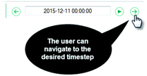
Navigate to a timestep
Fig. 6. 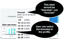
Timestep in the forecast profile


In the forecast profile (Fig. 6), we have what it seems to be a design error: where the label or header should be “timestep”, it is “forecast”. It harms the user interaction, since he can get confused. He might know that the profile presents timesteps, since he had previous experiences with WISE, but the word “forecast” where he would expect “timestep” could get him doubting the data.
-
4.
Open WISE on another browser window (w2). The necessity of two browser’s windows, as the scenario describes, is already an indication of problem for the proposed task. If the comparison is such an important task to be considered in a usability evaluation, WISE designers should think how the system could support the task in just on instance of WISE. The user resorts to a second browser window to compare different forecasts as a workaround since WISE does not provide the possibility to open two forecast at the same time. This characteristic could have been a conscious design decision, but if the user needs to find a way outside the system to perform the task, it could be an opportunity for reviewing the system design.
-
5.
Load forecast from 2015 - 12 - 10 00:00:00. No problem for that step, the same as in step 2.
-
6.
Select the timestep 2015 - 12 - 11 00:00:00. This step present the same problems as described in step 3.
-
7.
Choose the same cell ( latitude: - 22.92 and longitude: 316.83 ) on both maps of w1 and w2. As showed in Fig. 1, there are no axis or any indication regarding latitude and longitude values in the map. The user needs to go over the map and look in every tip showed once he hovers the mouse through map’s cells. He might need to resort to the zoom-in option to select a specific cell more easily.
-
8.
Compare meteograms on w1 and w2. We discussed the need of two browser windows in step 4, but this workaround also presents problems in the comparison step. The analyst opens two browser windows to compare the data in the meteograms, so he places the windows side by side on the screen. Once the windows are resized to fit on half screen, WISE adapts its interface and its interaction components, like forecast combo box, timestep navigator and property combo box. A new “menu” appears (Fig. 7). Originally, there were no menu grouping the interaction options. It might cause the user to get lost, even for a moment. This feature indicates that the WISE designers probably idealized that it could be used in different sizes of windows, like in our evaluation. Here we compared two forecasts, but the comparison could consider more forecasts, which would present more visualization problems.
Fig. 7. 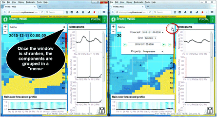
Meteograms’ comparison

4.3 Results Discussion
NH allowed the analyst to identify more general problems (lack of help documentation and error messages, interaction totally concentrate on mouse device), and also problems only identified once he took some time to explore and interact with the system (the user cannot go back to a previous state after accidentally clicking on the map, some profile data cannot be visualized properly). Considering the proposed scenario and user profile, to a certain extent, the analyst could also identify more focused problems like the red axis in the meteogram, which the analyst identified using the data of the proposed scenario. A different data could not show the red axis, letting it pass undiscovered by the analyst.
In CW, as a task-oriented evaluation, the analyst could focus on each step asking himself the proposed questions. The analyst could consider each interaction component related to each action or step. This “step-by-step” perspective allow him to take the user’s place and observe how the system behaved towards his interactions. The problems were much focused, but with potential of impact to the interaction as a whole (lack of label and incorrect label for timestep, the difficulty to locate a coordinate in the map). The scenario description already indicated a possible problem, since it indicated the necessity of two browser windows with WISE. The analyst identified the same action in two different steps, which allowed him to hypothesize about a potential problem regarding the necessity of two windows to compare data with WISE. The analyst, acting as user, decided how to perform the comparison step by organizing w1 and w2 side by side. This strategy presented other problems during interaction.
The systematic perspective of CW allowed the analyst to observe situations not even presented in the heuristic evaluation with its broader approach. In the NH, the analyst looked at each window in the last step separately, not considering what the user would have done in that situation. For the CW, the analyst arrange both windows side by side to see the meteograms from different forecasts at the same screen and performs the comparison. We highlighted the same problem about the forecast comparison task in our previous evaluation with CDNf [7].
The previous HCI evaluation with CDNf [7] focused on cognitive characteristics of notations used by the interface’s designers. CDNf works as a vocabulary that can be used by people to discuss the design of a new system or the redesign of a system already in use. While NH and CW focus on problems (heuristic violations and design error that could harm the learning by exploration process), CDNf offers a more flexible approach where designers can contextualize and discuss cognitive characteristics to explore in a particular environment, for example WISE as a visualization and insights environment. The combination of results from CDNf, NH, and CW provided WISE’s designers with a rich source of interaction problems that can be fixed, but also with other problems that might raise questions about some design decisions or trade-offs that might be harming the users’ interaction.
5 Final Remarks and Future Work
The results from NH and CW complemented each other as a broader approach and a task-oriented one. The analyst identified different problems for user interaction. Those problems are rich inputs for WISE’s redesign, looking to solve some of them. Other results might open some discussions with WISE’s designers about design decisions related to what the analyst called “problems”. Some of those could be related to a conscious decision from designers, considering some limitation or trade-offs during development. With an evidence of interaction problems related to those decisions, WISE’s designers might rethink some points of the current design.
We identified two opportunities for future work. The first one, related to evaluation methods, the analyst was able to map, almost directly, the definition of heuristics to cognitive dimensions during NH evaluation (e.g. NH’s “Match between system and the real world” and CDN’s “Closeness of mapping”). This relation between NH and CDN needs further investigation. The second one, related to visualization and insights environment’s types of errors. WISE does not handle errors per se (only handles one operational error), but pointed us to a discussion about the type of errors a visualization and insights environment should handle. Operational and interaction errors need to be handled due to usability issues, but there are the matter of tacit errors, related to the specific tasks of visualization and insights environments that support the decision-making process.
References
Shneiderman, B.: The eyes have it: a task by data type taxonomy for information visualizations. In: Proceedings of IEEE Symposium on Visual Languages, September 1996, pp. 336–343 (1996)
Few, S.: Data visualization for human perception. In: Soegaard, M., Dam, R.F. (eds.) The Encyclopedia of Human-Computer Interaction, 2nd edn. The Interaction Design Foundation, Aarhus, Denmark (2014)
Kulyk, O.A., Kosara, R., Urquiza, J., Wassink, I.: Human-centered aspects. In: Kerren, A., Ebert, A., Meyer, J. (eds.) GI-Dagstuhl Research Seminar 2007. LNCS, vol. 4417, pp. 13–75. Springer, Heidelberg (2007)
Fikkert, W., D’Ambros, M., Bierz, T., Jankun-Kelly, T.J.: Interacting with visualizations. In: Kerren, A., Ebert, A., Meyer, J. (eds.) GI-Dagstuhl Research Seminar 2007. LNCS, vol. 4417, pp. 77–162. Springer, Heidelberg (2007)
Mack, R.L., Nielsen, J. (eds.): Usability Inspection Methods. Wiley, New York (1994)
Oliveira, I., Segura, V., Dos Santos, M.N., Mantripragada, K., Ramirez, J.P., Cerqueira, R.: WISE: a web environment for visualization and insights on weather data. In: WVIS - 5th Workshop on Visual Analytics, Information Visualization and Scientific Visualization – SIBGRAPI (2014)
Ferreira, J.J., Segura, V., Cerqueira, R.: Investigating cognitive characteristics of visualization and insight environments: a case study with WISE. In Proceedings of the 14th Brazilian Symposium on Human Factors in Computing Systems (IHC 2015), Brazilian Computer Society, Porto Alegre, Brazil (2015, to be published)
Lewis, C., Wharton, C.: Cognitive Walkthroughs. Handb. Hum.-Comput. Interact. 2, 717–732 (1997)
Nielsen, J.: Heuristic evaluation. In: Nielsen, J., Mack, R.L. (eds.) Usability Inspection Methods. Wiley, New York (1994)
Nielsen Norman Group: https://www.nngroup.com/articles/ten-usability-heuristics/
Wharton, C., Rieman, J., Lewis, C., Polson, P.: The cognitive walkthrough method: a practitioner’s guide. In: Usability inspection methods, pp. 105–140. Wiley (1994)
Author information
Authors and Affiliations
Corresponding author
Editor information
Editors and Affiliations
Rights and permissions
Copyright information
© 2016 Springer International Publishing Switzerland
About this paper
Cite this paper
Ferreira, J.J., Segura, V., Cerqueira, R. (2016). Investigating Cognitive Characteristics of Visualization and Insight Environments: A Case Study with WISE. In: Yamamoto, S. (eds) Human Interface and the Management of Information: Information, Design and Interaction. HIMI 2016. Lecture Notes in Computer Science(), vol 9734. Springer, Cham. https://doi.org/10.1007/978-3-319-40349-6_12
Download citation
DOI: https://doi.org/10.1007/978-3-319-40349-6_12
Published:
Publisher Name: Springer, Cham
Print ISBN: 978-3-319-40348-9
Online ISBN: 978-3-319-40349-6
eBook Packages: Computer ScienceComputer Science (R0)