
Abstract
Previous chapters have presented statistical techniques for studying the relationship between a response variable and a single explanatory variable. The remaining chapters discuss techniques that investigate the relationship between a response variable and two or more explanatory variables, and that determine whether the impact of one explanatory variable varies across values of a second. In this chapter, two-way analysis of variance, also known as two-way ANOVA, is reviewed. This technique is appropriate when the response variable is quantitative, and is used to test null hypotheses about the main effects of two categorical explanatory variables, and the interaction effect between them. Three examples of two-way ANOVA are discussed: one in which both explanatory variables are independent groups, one in which both are repeated measures, and one in which one variable is independent groups and one is repeated measures.
Keywords
These keywords were added by machine and not by the authors. This process is experimental and the keywords may be updated as the learning algorithm improves.
12.1 Overview
As we saw in the last chapter, in many circumstances researchers wish to compare the means of three or more groups. If the measurements are quantitative, a one-way analysis of variance (ANOVA) is often employed. Unlike the independent samples t-test, one-way ANOVA can accommodate more than two means at a time. For example, the blood pressure means of three groups of hypertensive patients—those who had received a new treatment, had received a standard treatment, or had received no treatment—could be compared in a single analysis.
In addition to being able to compare several means simultaneously, ANOVA can also assess the effects of two or more categorical factors in a single analysis, and whether the effect of a factor changes across values of another. For example, a two-way ANOVA could assess whether blood pressure was significantly related to the sex of hypertensive patients who had participated in a clinical trial of a new treatment, whether the treatment significantly reduced their blood pressure, and whether the benefit of the treatment was significantly greater for men or women. If race were added to this analysis, a three-way ANOVA could be employed to study the individual and combined effects of race, sex, and treatment.
Ideally, the observations will have been made within the context of a controlled experiment in which two or more causal factors were manipulated by the researcher. In these cases, if the results of an ANOVA reveal significant differences across groups, then causality can be established. Often, though, comparisons are made across factors that cannot be manipulated (e.g., gender, race, prior exposure to a risk factor). In these cases, the results of an ANOVA reveal only if differences across groups are statistically significant. The cause of the differences cannot be established.
In theory, there is no limit to the number of factors that can be included in an ANOVA. However, experiments that include a large number of factors can be very expensive and time consuming to conduct. Moreover, the relationships among a large number of factors can be quite complex and difficult to understand. Consequently, researchers seldom conduct an ANOVA that includes more than a handful of factors.
In this chapter, we will focus on the two-way ANOVA. In our first analysis, both factors will be independent groups. In the second analysis, both will be repeated measures. In the third, we will conduct a two-way ANOVA with one independent groups factor and one repeated measures factor.
12.2 ANOVA with One Independent Groups Factor
Before we conduct an ANOVA with two independent groups factors, let us take another look at the one-way ANOVA. Recall that the one-way ANOVA has one independent groups factor. In this section, we will ascertain whether the body mass index (BMI) of female respondents between the ages of 35 and 54, inclusive, is related to engagement in physical activity. Note that in the analysis, we will have a quantitative response variable and a categorical explanatory variable. Note also that an independent-samples t-test would be appropriate as an alternative to the ANOVA in this situation as we will be comparing the means of two groups. In this instance, though, we will choose the ANOVA so as to facilitate our later discussion of two-way ANOVA.
Load the data file, CDC BRFSS.sav [1]. Begin by assigning labels to the values of the variable, NO PHYSICAL ACTIVITY OR EXERCISE RISK FACTOR [@_RFNOPA] (variable 102; 1 = Engaged in Physical Activity, 2 = Did not Engage in Physical Activity), and declare the value of 9 as missing. Next, label two of the values of the variable, SIX LEVEL IMPUTED AGE CATEGORY [@_AGE_G] (variable 74) as follows: 3 = 35 to 44 and 4 = 45 to 54. Then, using Data > Select Cases, select female respondents who belong to either the 35 to 44 or 45 to 54 age category. Respondents’ sex is stored in SEX [SEX] (variable 32; 1 = Male, 2 = Female).
SPSS offers two procedures that will carry out an ANOVA involving one independent groups factor. One procedure, called One-Way ANOVA, can be used only when there is one explanatory factor and the factor is independent groups. The second procedure, called General Linear Model (GLM) is much more flexible. For example, GLM can conduct an ANOVA with two or more factors and the factors can be either independent groups or repeated measures. We will use GLM in this chapter.
As shown in Figs. 12.1 and 12.2, select Analyze > General Linear Model > Univariate to bring up the Univariate dialog box. Move BODY MASS INDEX [BMI] (variable 107) into the Dependent Variable box. Now move NO PHYSICAL ACTIVITY OR EXERCISE RISK FACTOR into the Fixed Factor(s) box.

Opening the Univariate dialog

Selecting the dependent variable and fixed factor, and opening the Univariate: Profile Plots dialog
We will want to create a means plot so as shown in Fig. 12.2, click Plots to bring up the Univariate: Profile Plots dialog box. Then as shown in Fig. 12.3, move the physical activity variable into the Horizontal Axis box, click Add, followed by Continue.

Requesting a means plot of the main effect of physical activity
Next, we will want to generate some descriptive statistics and an effect size analysis, so in the Univariates dialog, click Options to bring up the Univariate: Options dialog box shown in Fig. 12.4. Move (OVERALL) and the physical activity variable to the Display Means for box, and check Descriptive statistics in the Display area. Click Continue. Back in the Univariates dialog, click OK.

Requesting tables displaying the overall mean, the means of the main effect of age, and descriptive statistics
Study the resulting output reproduced in Tables 12.1 and 12.2, and Fig. 12.5. The output should have a familiar look, thanks to Chap. 10.

Means plot of the main effect of physical activity on body mass index
Answer the following questions regarding the null hypothesis that the population BMI means of the two physical activity groups are equal:
12.2.1 What is the mean BMI for each of the two physical activity groups?
12.2.2 Are these means accurately reflected in the means plot?
12.2.3 What is the value of the F ratio?
12.2.4 What are the numerator and denominator degrees of freedom?
12.2.5 What is the p-value?
12.2.6 Do the data indicate that BMI is related to physical activity for female residents of NY state who are between the ages of 35 and 54?
12.3 ANOVA with Two Independent Groups Factors
In the previous section, we saw that BMI was significantly related to engagement in physical activity. In the jargon of the ANOVA, we found what is called a significant main effect of physical activity. In this section, we will see if BMI is also related to respondents’ age category. That is, we will see if there is also a significant main effect of age category. In addition, we will see whether the relationship between physical activity and BMI depends upon the respondents’ age category. In the jargon of ANOVA, we will see if there exists a significant interaction effect between physical activity and age category.
Before we begin, notice that by adding a second factor to our analysis, we will now have a two-way ANOVA. The term “two-way” indicates that we are categorizing participants in two ways—by whether or not they engaged in physical activity and by their age category. Notice too that our second factor is independent groups. So we will be carrying out a two-way ANOVA in which both factors are independent groups variables.
Return to the Univariate dialog box, and as shown in Fig. 12.6, move SIX LEVEL IMPUTED AGE CATEGORY into the Fixed Factor(s) box to tell SPSS that we wish to add age category as a factor. Remember that earlier we used Select Cases to limit the analysis to two age categories, women between the ages of 35 and 44 and women between the ages of 45 and 54.

Adding age category as a second factor to the analysis of variance
In the previous analysis, we asked SPSS to plot the mean BMI of those who had engaged in physical activity and the mean BMI of those who had not. Recall that these two means were significantly different. The resulting plot, therefore, displayed a significant main effect of physical activity. Now let us add a plot for the age variable. This plot will show the mean BMI of each of the two age groups and indicate whether there is a main effect of age category. We will also create what is known as an interaction plot to see whether there is an interaction effect involving physical activity and age category, that is, if the relationship between physical activity and BMI varies with age category.
To generate these graphs, click Plots in the Univariate dialog box. As shown in Fig. 12.7, move SIX LEVEL IMPUTED AGE CATEGORY to the Horizontal Axis box, and click Add. This plot will display the mean BMI of the two age categories. Next, as shown in Fig. 12.8, move the physical activity variable to the Horizontal Axis box and SIX LEVEL IMPUTED AGE CATEGORY to the Separate Lines box. Click Add. This plot will display the mean BMI of four independent groups: women who were between the ages of 35 and 44 who had engaged in physical activity, women who were between the ages of 35 and 44 who had not, women between the ages of 45 and 54 who had engaged in physical activity, and women between the ages of 45 and 54 who had not. Now click Continue to get back to the Univariate dialog box.

Adding a request for a means plots of the main effect of age category

Adding a request for a means plot of the interaction effect between physical activity and age category
Back in the Univariate dialog, click Options. As shown in Fig. 12.9, add the age variable and its interaction with physical activity to the Display Means for box. Click Continue followed by OK to run the analysis.

Adding a request for tables displaying the means of the main effect of age category and the interaction effect between physical activity and age category
Main Effects
The output has much the same look as before, but now there is more of it as a result of adding a second factor to the analysis. The output begins with information about sample sizes, shown in Table 12.3.
Table 12.4 displays the mean BMI of the 1673 women who had engaged in physical activity and the mean BMI of the 139 women who had not. Figure 12.10 is the plot of those two means. This information is relevant to the main effect of physical activity.

Means plot of the main effect of physical activity on BMI
Table 12.5 displays the mean BMI of the 849 women between the ages of 35 and 44, and the mean BMI of the 963 women between the ages of 45 and 54. Figure 12.11 is the plot of those two means. This information is relevant to the main effect of age category.

Means plot of the main effect of age category on BMI
Judging by the output thus far, it appears that both physical activity and age category are related to BMI. However, these findings may have been due to random sampling variability. So for each of two main effects we observed in our sample, we need to determine the probability that it would occur if there is no such effect in the population of NY state women. To do this, we refer to the p-value of each main effect. To find these values, we would consult the table labeled, Tests of Between-Subjects Effects, shown in Table 12.6.
This table is similar to the one we created when we conducted our one-way ANOVA earlier in the chapter, but it now includes the F ratio, degrees of freedom, and p-value associated with not only the relationship between physical activity and BMI but with the relationship between age category and BMI as well.
12.3.1 Do the data indicate that the population BMI means differ across the two physical activity groups?
12.3.2 Did we find a significant main effect of physical activity?
12.3.3 Do the data indicate that the population BMI means differ across the two age groups?
12.3.4 Did we find a significant main effect of age category?
Interaction Effect
The inclusion of age as a second factor results in output that tells us whether the relationship between physical activity and BMI varies according to the age category of the participant. When the strength or direction of a relationship between one factor and a response variable depends on the values of a second factor, an interaction effect between the two factors is said to be present. To determine whether there is an interaction effect, we can inspect the mean BMI values of each of the four groups of women, and compare the difference between the two mean BMI values of the women between the ages of 35 and 44 who had and had not engaged in physical activity with the difference between the two mean BMI values of the women between the ages of 45 and 54 who had and had not engaged in physical activity. Tables 12.7 and 12.8 display this information. Table 12.7 highlights the BMI means of the two physical activity groups for women between 34 and 44, while Table 12.8 highlights the BMI means of women between 45 and 54.
Answer the following questions:
12.3.5 Judging from the 4 BMI means, which age group seems to benefit from engagement in physical activity?
12.3.6 Does the pattern of the 4 BMI means suggest an interaction effect between engagement in physical activity and age category?
We see that for the younger group of women, those who had engaged in physical activity and those who had not had about the same average BMI, but that for the older women, those who had engaged in physical activity had an average BMI substantially lower than those who had not engaged in physical activity.
Comparing the effect of physical activity on the average BMI of older women to the effect of physical activity on the average BMI of younger women is made easier by inspecting the interaction plot that displays these four means. Study this display, shown in Fig. 12.12. (We modified the formatting of the figure slightly to better distinguish in grayscale the two age categories.) Note whether the relationship between physical activity and BMI seems to differ across the two age categories. To be sure that you understand the graph, see if you can find in the graph each of the four means singled out in Tables 12.7 and 12.8.

Means plot of the interaction effect between physical activity and age category on BMI
The graph tells us that the relationship between whether or not women were physically active and their BMI depended on the age category of the women. In the language of ANOVA, we can say that engagement in physical activity appears to interact with age.
As you may have guessed from the interaction plot, an interaction effect is evidenced by the lack of parallelism between the lines displayed in the graph. However, as with any sample result, the lack of parallelism in our sample may have been due to random sampling variability and not to an interaction in the population. Consequently, we need to test the null hypothesis that there is no interaction in the population against the alternative hypothesis that there is an interaction. In other words, we need to determine the probability that the sample interaction effect would have occurred if there were no interaction effect in the population.
We can discover this probability by consulting the row in the Tests of Between-Subjects Effects table, displayed in Table 12.9. If we consult the row labeled @_RFNOPA*@_AGE_G, we will find the F-ratio for the interaction effect and its associated p-value.
Answer the following questions:
12.3.7 Was the interaction effect between physical activity and age category statistically significant?
12.3.8 Can we reject the null hypothesis that in the population from which the sample was taken, physical activity benefits both age groups equally?
According to Table 12.9, the probability that the interaction we observed in our sample would have occurred if there is no interaction in the population is 0.003. This probability tells us that it is highly unlikely that we would have observed in our sample the interaction between physical activity and age category if there were no such interaction in the population of NY state women. Therefore, from our sample, we can infer with great confidence that the relationship between physical activity and BMI for female residents of NY depends on whether they are 35–44 years of age or 45–54 years of age.
The existence of a significant interaction effect forces us to be cautious about how we interpret the separate effects of each of the factors involved in the interaction, that is, how we interpret the main effects. For example, consider again the plot of the main effect of physical activity, shown in Fig. 12.10. This graph compares the mean BMI of those who had been physically active with those who had not, regardless of their age category. Our inspection of the interaction plot, reproduced in Fig. 12.12, tells us that we would be mistaken if we were to conclude that the main effect of physical activity describes equally well the relationship between physical activity and BMI for both age groups.
12.4 ANOVA with Two Repeated Measures Factors
In the preceding analysis, we conducted a two-way ANOVA in which each factor formed independent groups. In the next two sections, you will learn how to interpret a two-way ANOVA when at least one of the factors is repeated measures. We will begin with a study that used two repeated measures factors.
The file, Blood.sav [2], consists of systolic and diastolic blood pressures (mm Hg) of 15 hypertensive patients who had been given the drug, captopril. Each patient’s blood pressure was measured twice, immediately before and 2 h after the drug was administered. Let us investigate the effects of this drug on blood pressure.
We will begin by studying the structure of the data file, reproduced in Fig. 12.13. Note that, as usual, each row contains the data from each participant. In this data set, the first variable refers to patient number (1 through 15), and the next four variables contain the blood pressure readings. Note the ordering of the last four columns: The researchers chose to enter the systolic readings before the diastolic, and for each type of blood pressure, the before reading prior to the after reading.

Blood.sav data set
We will determine if systolic blood pressure was greater than diastolic (which of course it should have been), whether blood pressure dropped significantly after the drug was given, and whether the drug had the same effect on systolic and diastolic blood pressure. In the language of ANOVA, we will see if there was a significant main effect of type of blood pressure (systolic vs. diastolic), a significant main effect of time of measurement (before vs. after), and a significant interaction effect between time of measurement and type of blood pressure.
As with our earlier two-way ANOVA, the outcome variable is quantitative and the explanatory variables are categorical. But this time both explanatory factors are repeated measures. This is because each patient had both types of blood pressure readings taken at both points in time. Consequently, we will be conducting a two-way repeated measures ANOVA.
Select Analyze > General Linear Model > Repeated Measures to bring up the Repeated Measures Define Factor(s) dialog box. In the Within-Subject Factor Name box, we will enter a name for the repeated measures factor, Type of Blood Pressure . To minimize typing time and output space, just enter the word, Type . In the Number of Levels box, enter 2, and then click Add. Now enter the second repeated measures factor, Time of Measurement , by entering the word, Time, into the Within-Subject Factor Name box. In the Number of Levels box, enter 2, and then click Add. In the Measure Name box, enter the name of our response variable, Blood Pressure, by entering the word, Pressure. Click Add. These steps are shown in Figs. 12.14, 12.15, 12.16, and 12.17.

Opening the Repeated Measures Define Factor(s) dialog

Defining type of blood pressure as a repeated measures factor

Defining time of measurement as a repeated measures factor

Naming the response variable and opening the Repeated Measures dialog
At this point, we have told SPSS to execute an ANOVA with two repeated measures factors we have called Type and Time on an response variable we have called Pressure We have also told SPSS that each of the two factors has two values. SPSS will therefore expect that there will be a column of data for each of the four combinations of the values of the two factors. Our next step is to tell SPSS which column of data corresponds to which combination of the values of the factors.
As shown in Fig. 12.17, click Define to bring up the Repeated Measures dialog displayed in Fig. 12.18. Here, we will match up each relevant column of data listed in the window to the left to each of the combinations of the values of the factors, Type and Time, listed in the Within-Subjects Variables window to the right.

Repeated measures dialog
Let us look more closely at the Within-Subjects Variables window. Note that the names of the repeated measures factors, Type and Time, are listed in parentheses just above the window. The factors are listed in the order we entered them in the previous dialog box. Type is listed first, Time second. Below the names of the factors and also within parentheses are two digits, 1 and 2, followed by the name of our response variable, that is, (1,1,Pressure), (1,2,Pressure) and so on. Recall that each factor has two levels: Systolic and Diastolic for the factor, Type; and Before and After for the factor, Time. For each pair of digits, the first number refers to one of the two levels of the first factor, Type; and the second number refers to one of the two values of the second factor, Time.
Our next step is to move each column of blood pressure readings listed in the window to the left to the Within-Subjects Variables window. Highlight Systolic: Before and then click the right arrow to move this set of readings to the 1,1 combination of Type and Time. In the same manner, move Systolic: After to the 1,2 combination of Type and Time. Repeat for the remaining two combinations of Type and Time and you should have produced the dialog box shown in Fig. 12.19.

Selecting the variables corresponding to the four combinations of the repeated measures factors, and opening the Repeated Measures: Profile Plots dialog
Now, we will set up our plots for the main effects of Type and Time and the interaction between the two. As shown in Fig. 12.19, click Plots and create three graphs in the Repeated Measures: Profile Plots dialog: one which will display the relationship between mean blood pressure and type of blood pressure (i.e., a graph that will list the values of Type on the horizontal line), one which will display the relationship between mean blood pressure and the time of measurement (i.e., a graph that will list the values of Time on the horizontal line), and one which will display the relationship between mean blood pressure and time of measurement for each type of blood pressure (i.e., a graph that will list the values of Time on the horizontal line and display the two types of blood pressure as separate lines). When you have finished, the Repeated Measures: Profile Plots dialog should look like Fig. 12.20.

Requesting means plots of the main effects of type of pressure and time of measurement, and of the interaction between type of pressure and time of measurement
Click Continue to return to the Repeated Measures dialog, and then Options to open the Repeated Measures: Options dialog. Tell SPSS to display means for all factors and factor interactions. Then select Descriptive statistics. When you have finished, the Options dialog should look like the one in Fig. 12.21. Click Continue to return to the Repeated Measures dialog box, and OK to run the analysis.

Requesting tables displaying the overall mean, the means of the main and interaction effects, and descriptive statistics
Main Effects
The output should have a familiar look, thanks to our review of one-way repeated measures ANOVA in Chap. 11. This time though we have descriptive statistics, means plots, and F-ratios relevant to the investigation of two main effects instead of just one, and for the investigation of an interaction effect.
Let us begin our study of the output with a trivial question: Was systolic blood pressure significantly different from diastolic? Inspection of the means displayed in Table 12.10 or of the corresponding means plot in Fig. 12.22 tells us not surprisingly that on the average, systolic blood pressure was greater than diastolic.

Means plot of the main effect of type of blood pressure: systolic (Type = 1) versus diastolic (Type = 2)
To determine whether these two means were significantly different, that is, to determine whether there was a significant main effect of type of blood pressure, we do what we had done in Chap. 11—we consult the table labeled Tests of Within-Subjects Effects. We find the row labeled Type and its corresponding F-ratio, degrees of freedom, and p-value. That row can be found in Table 12.11.
Answer the following questions:
12.4.1 What was the value of the F-ratio?
12.4.2 What were the numerator and denominator degrees of freedom associated with the F-ratio?
12.4.3 What was the p-value associated with the F-ratio?
12.4.4 Can we reject the null hypothesis that in the population from which the sample was taken, mean systolic and diastolic blood pressures are equal?
12.4.5 In this analysis, we do not have to be concerned about whether we can assume sphericity. Why?
According to the table, mean systolic blood pressure was significantly different from mean diastolic blood pressure. That is, a significant main effect of type of blood pressure was found.
Now let us focus on whether the drug seemed to have an effect on blood pressure. Inspection of Table 12.12 or of the corresponding means plot in Fig. 12.23 tells us that blood pressure declined following administration of the drug.

Means plot of the main effect of time of measurement on blood pressure: before (Time = 1) and after (Time = 2) administration of captopril
To determine whether these two means were significantly different, that is, to determine whether there was a significant main effect of type of blood pressure, we consult the row labeled Time in the Tests of Within-Subjects Effects table. That row can be found in Table 12.13.
Answer the following questions:
12.4.6 Were the two means displayed in Table 12.13 significantly different?
12.4.7 Does the analysis support the conclusion that captopril reduces blood pressure?
Interaction Effect
Our last finding has to do with whether the relationship between time of measurement and blood pressure depended on the type of blood pressure measured. Inspection of the means found in Table 12.14 or of the corresponding interaction plot of Fig. 12.24 suggests that although both types of blood pressure declined after administration of the drug, the decline was somewhat greater for systolic pressure.

Means plot of systolic (Type = 1) and diastolic (Type = 2) blood pressures before (Time = 1) and after (Time = 2) administration of captopril
To determine whether there was a significant interaction effect between the type of blood pressure and the time of measurement, we consult the row labeled Time * Type in Tests of Within-Subjects Effect. That row is included in Table 12.15.
Answer the following questions:
12.4.8 Was the interaction effect statistically significant?
12.4.9 Can we reject the null hypothesis that captopril reduces systolic and diastolic blood pressure equally?
As usual, the existence of a significant interaction forces us to be careful when we interpret the main effects. As we can see by comparing Figs. 12.23 and 12.24, the main effect of time of measurement (mean blood pressure before vs. mean blood pressure after; Fig. 12.23) somewhat underestimates the drug’s effect on systolic blood pressure and somewhat overestimates the drug’s effect on diastolic blood pressure (Fig. 12.24).
12.5 ANOVA with One Independent Groups and One Repeated Measure Factor
As our last example of a two-way ANOVA, we will return to a study that we encountered in the previous chapter: the effects of acupuncture on severity of chronic headaches. In this study, 401 male and female patients who suffered from chronic headache were randomly assigned to one of two conditions: Acupuncture and Control. Patients assigned to the acupuncture group were referred by their general practitioners to acupuncturists who offered weekly sessions for a period of 3 months. Patients in the control group were not referred. Three months (3-month follow-up) and again 12 months (1-year follow-up) later, the severity of the patients’ headaches was assessed and compared to their baseline severity ratings obtained at the beginning of the study.
In the previous chapter, we used a paired-samples t-test to compare the baseline and 3-month follow-up severity ratings of the patients who were referred to acupuncture treatment. There we saw that the mean severity rating at 3-month follow-up was significantly less than at baseline. However, before we can credit this decline to the acupuncture treatment, we have to determine whether this decline was greater than any that might have been reported by the control group. So this time we will compare the baseline to 3-month follow-up changes in severity ratings of the acupuncture and control groups. We will do this by using a two-way ANOVA.
Data from this study are in Acupuncture.sav [3]. The group to which each patient was assigned is stored in the variable, Group [group] (variable 6; 0 = Control, 1 = Acupuncture). Because each group consists of a different set of patients, the group variable is independent groups. Each patient within each group rated his or her headache severity at baseline, 3-month follow-up and 1-year follow-up. These measurements are stored in the variables Headache Severity at Baseline [hs0] (variable 7), Headache Severity at 3 Months Follow-up [hs3] (variable 8), and Headache Severity at One Year Follow-up [hs12] (variable 9). This set of three measurements will constitute a repeated measures variable that we will call Time of Measurement. Note that the two-way ANOVA will consist of a categorical variable that is independent groups (Group) and a second categorical variable that is repeated measures (Time of Measurement). As is always the case with ANOVA, the response variable is quantitative. In this case, the response variable is Headache Severity.
12.5.1 If we were to predict that acupuncture is effective in treating chronic headache, would we predict an interaction effect between Groups and Time of Measurement? Why or why not?
Load the data file, Acupuncture.sav. Because our analysis will include a repeated measures factor, select Analyze > General Linear Model > Repeated Measures to bring up the now familiar Repeated Measures Define Factor(s) dialog box. Assign a name to the repeated measures factor—the name Time will do—and tell SPSS that it has two levels. Then assign a Measure Name. This is our response variable. Severity will do. When you have finished, the dialog box should look similar to the one in Fig. 12.25.

Defining the repeated measures factor, naming the response variable, and opening the Repeated Measures dialog
As shown in Fig. 12.25, click Define to bring up the Repeated Measures dialog box. Move the baseline and 3-month follow-up variables to the Within-Subjects Variables window.
At this point, you have told SPSS that you wish to conduct an ANOVA on a response variable called Severity , that the ANOVA has one explanatory factor, Time , and that the factor is repeated measures and has two values. If we were to run the analysis now, we would generate a one-way repeated measures ANOVA. But we want a two-way ANOVA. What’s missing?
We need to tell SPSS that there is a second factor, Group, and that the second factor is independent groups. To do this, move Group into the window labeled Between-Subjects Factor(s) by selecting it and clicking the right pointing arrow to the left of the Between-Subjects Factor(s) window. Now the dialog box should look like the one in Fig. 12.26.

Assigning variables corresponding to the two values of the repeated measures factor, selecting the independent groups factor, and opening the Repeated Measures: Profile Plots dialog
Next, click Plots and tell SPSS to plot the main effects of Time and Group and the interaction between the two factors. For the interaction plot, put Time on the X-axis. When you’re done, the Profile Plots dialog should look like Fig. 12.27. Click Continue.

Requesting means plots of the main effects of time of measurement and group, and of the interaction effect between the two factors
Back in the Repeated Measures dialog, click Options and instruct SPSS to generate descriptive statistics for all of the variables, as shown in Fig. 12.28. Click Continue and then OK to run the analysis.

Requesting tables displaying the overall mean, the means of the main and interaction effects, and descriptive statistics
The layout of the output is the same as with the analyses of Sects. 12.3 and 12.4 in that the output provides information about two factors. For example, the output will display the means that correspond to the four combinations of the two factors (Table 12.16), and a means plot of those means (Fig. 12.29). This time, though, one of the factors is independent groups and the other repeated measures. Consequently, to see if the study generated a significant main effect of Group, inspect the table labeled Tests of Between-Subjects Effects (Table 12.17). To see if the study generated a significant main effect of Time or a significant interaction between Group and Time, inspect the table labeled Test of Within-Subjects Effects (Table 12.18).

Means plot of the headache severity ratings of the control and acupuncture groups at baseline (Time = 1) and 3-month follow-up (Time = 2)
Study the output, remembering that higher severity ratings indicate greater headache severity. Then answer the following questions:
12.5.2 What was the p-value for the main effect of Group?
12.5.3 Was the mean severity rating at 3-month follow-up significantly less than the mean severity rating at baseline?
12.5.4 What was the mean headache severity rating of the acupuncture group at 3-month follow-up?
12.5.5 Did the acupuncture group experience an average change in severity at 3-month follow-up that was significantly different from the average change experienced by the control group?
12.5.6 What was the p-value for the interaction effect?
12.5.7 Do the statistical results of this study support the hypothesis that acupuncture reduces headache severity? Why or why not?
12.6 Exercise Questions
-
1.
For people between the ages of 35 and 44, is participation in physical activity associated with mental health? Is the answer to this question different for men and women? To find out, a researcher analyzed the CDC BRFSS data set. The results of the analysis are displayed in Figs. 12.30 and 12.31, and in Table 12.19.
Fig. 12.30 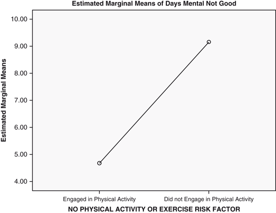
Means plot of the relationship between reported number of days during the past month mental health was “not good” and physical activity (Question 1)
Fig. 12.31 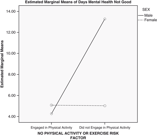
Means plot of the relationship between reported number of days during the past month mental health was “not good” and physical activity for men and women (Question 1)
Table 12.19 Tests of the main and interaction effects (Question 1)


-
a.
What is the response variable?
-
b.
Is the response variable categorical or quantitative?
-
c.
What are the explanatory variables?
-
d.
Are the explanatory variables independent groups or repeated measures factors?
-
e.
Ignoring gender, was mental health significantly related to physical activity?
-
f.
Report the values of the F-ratio, degrees of freedom, and p-value associated with the main effect of physical activity.
-
g.
Describe the main effect of physical activity.
-
h.
Does the relationship between physical activity and mental health differ significantly for men and women? What was the p-value associated with this finding?
-
i.
Describe the interaction effect between physical activity and sex.
-
2.
Using a crossover design, a researcher gave five patients two drugs in tablet form. Drug A was given first. After a washout out period, each patient was given Drug B. For each drug, the researcher measured the level of antibiotic blood serum present at four points in time following ingestion: 1 h, 2 h, 3 h and 6 h. The data are in the file, Groups.sav [4]. Conduct a two-way ANOVA.
-
a.
What is the response variable? Is it categorical or quantitative?
-
b.
What are the explanatory variables? Are they independent groups or repeated measures factors?
-
c.
Fill in the empty 15 cells of Table 12.20 with the appropriate means.
Table 12.20 Mean antibiotic blood serum
-
d.
Did the two drugs differ significantly in the overall amount of antibiotic blood serum they produced? What is the p-value associated with this finding?
-
e.
Did the number of hours following ingestion produce a significant main effect? What are the values of the means associated with this effect?
-
f.
Did the effect of the number of hours following ingestion significantly depend on which drug had been ingested? What is the p-value associated with the answer to this question?
-
g.
When you answered questions 2e and 2f, did you have to take into account the results of the Mauchly's Test of Sphericity? Why or why not?
-
3.
Return to the acupuncture data and include the 1-year follow-up measurement in the analysis.
-
a.
If we were to predict that acupuncture is effective in treating chronic headache, would we predict an interaction effect between groups and time of measurement? Why or why not?
-
b.
Did the mean severity ratings at baseline, 3-month follow-up, and 1-year follow-up significantly differ? What is the p-value associated with this main effect?
-
c.
What was the p-value for the main effect of Group?
-
d.
Did the decline in severity from baseline to 1-year follow-up differ across the acupuncture and control groups? What is the p-value associated with this finding?
-
e.
Do the statistical results of this study support the hypothesis that acupuncture reduces headache severity? Why or why not?
Data Sets and References
CDC BRFSS.sav obtained from: Centers for Disease Control and Prevention (CDC). Behavioral Risk Factor Surveillance System Survey Data. US Department of Health and Human Services, Centers for Disease Control and Prevention, Atlanta (2005). Public domain. For more information about the BRFSS, visit http://www.cdc.gov/brfss/. Accessed 16 Nov 2014
Blood.sav obtained from: Hand, D.J., Daly, F., Lunn, A.D., McConway, K.J., Ostrowski, E.: A Handbook of Small Data Sets. Chapman & Hall, London (1994). With the kind permission of the Routledge Taylor and Francis Group, and Professor Graham A. MacGregor. For context, see MacGregor, G.A., Markandu, N.D., Roulston, J.E., Jones, J.C.: Essential hypertension: effect of an oral inhibitor of angiotensin-converting enzyme. Br. Med. J. 2, 1106–1109 (1979)
Acupuncture.sav obtained from: Vickers, A.J., Rees, R.W., Zollman, C.E., et al.: Acupuncture for chronic headache in primary care: large, pragmatic, randomised trial. BMJ. (2004). doi:10.1136/bmj.38029.421863.EB. (With the kind permission of Professor Andrew J. Vickers)
Groups.sav obtained from: Hand, D.J., Daly, F., Lunn, A.D., McConway, K.J., Ostrowski, E.: A Handbook of Small Data Sets. Chapman & Hall, London (1994). (With the kind permission of Professor David J. Hand)
Author information
Authors and Affiliations
Corresponding author
Rights and permissions
Copyright information
© 2014 Springer International Publishing Switzerland
About this chapter
Cite this chapter
Holmes, W., Rinaman, W. (2014). Analysis of Variance with Two Factors. In: Statistical Literacy for Clinical Practitioners. Springer, Cham. https://doi.org/10.1007/978-3-319-12550-3_12
Download citation
DOI: https://doi.org/10.1007/978-3-319-12550-3_12
Published:
Publisher Name: Springer, Cham
Print ISBN: 978-3-319-12549-7
Online ISBN: 978-3-319-12550-3
eBook Packages: Mathematics and StatisticsMathematics and Statistics (R0)