
Abstract
The importance of nutrition for Parkinson’s disease patients has been acknowledged in many papers. On the other hand, the usability of tools supporting nutrition interventions is not well studied. This paper presents a case study on how to design a nutrition tracking mobile application for users with Parkinson’s disease. We focus on the design choices made to accommodate users and findings from usability testing with users.
You have full access to this open access chapter, Download conference paper PDF
Keywords
1 Introduction
Parkinson’s disease (PD) is a long-term disorder of the central nervous system that mainly affects the motor system. It belongs to a group of conditions called motor system disorders, which are the result of the loss of dopamine-producing brain cells. The four primary symptoms of PD are tremor, or trembling in hands, arms, legs, jaw, and face; rigidity, or stiffness of the limbs and trunk; bradykinesia, or slowness of movement; and postural instability, or impaired balance and coordination. As these symptoms become more pronounced, patients may have difficulty walking, talking, or completing other simple tasks [1]. There are 10 million patients worldwide (1.2 million in the EU [2]). Their lives are dependent on others and there is no cure, we can only postpone the onset of symptoms or treat their severity. “The combined direct and indirect cost of Parkinson’s, including treatment, social security payments and lost income from inability to work, is estimated to be nearly $25 billion per year in the United States alone. Medication costs for an individual person with PD average $2,500 a year, and therapeutic surgery can cost up to $100,000 dollars per patient” [2].
Given the above, it is no surprise that several research projects have been funded to advance our knowledge of PD (Rempark1Footnote 1, Sense-ParkFootnote 2, CupidFootnote 3, NeurotremorFootnote 4). The work presented in this article was part of the PD_managerFootnote 5 project, which built and evaluated an innovative, mHealth, patient-centric ecosystem for Parkinson’s disease management. More specifically the aim of PD_manager was to:
-
1.
model the behaviors of intended users of PD_manager (patients, caregivers, neurologists and other health-care providers),
-
2.
educate patients, caregivers and healthcare providers with the focus on occupational and speech therapies and
-
3.
propose a set of unobtrusive, simple-in-use, cooperative, mobile devices that will be used for symptoms monitoring and collection of adherence data (smartphone, sensor insole, smart pillbox, wristband with sensors for acceleration, heart rate, etc.).
Many studies exist on ICT solutions to aid people with Parkinson’s, from passive monitoring to tele-rehabilitation [3]. This paper focuses on the design and evaluation of a user interface of a mobile application for tracking nutrients and foods consumed by Parkinson’s disease patients.
2 Design Decisions and Argumentation
The design started with a literature review, which includes interfaces for the elderly [4,5,6,7] and for people with Parkinson’s [8,9,10,11,12,13], yet we were unable to find anything specific on designing nutrition tools for Parkinsonians (despite nutrition being recognized as important to manage the disease).
We designed an information structure that helps users understand the system and designing an interaction that makes it easy for them to finish a given task. Our goal was to design whole experience more user-friendly by designing the interface that enables users to quickly recognize the objects on the screen. With specifically designed visual language provides we helped patients to locate interactive elements on screen, pay attention to the most important information and differentiate between input text and instructions. Furthermore, it enabled users to understand which functions are available to them and stay aware of the current activity that they are participating in.
Design choices were made with patients in mind and were grounded in design principles of graphical user-interfaces and visual communications. We used color and shape in a way that utilizes selective and associative perception of the visual variable. We determined the same color for objects with the same functionality, which made it easy for users to recognize, locate and isolate them and group them into categories (e.g. static and interactive objects). We used the difference of shape to enable users to differentiate between subcategories, while preserving the perception of the main categories (e.g. icons of functions and input suggestions – both interactive objects). We designed a few instances of different brightness of information and increasing the difference between them to establish visual hierarchy and make it easier for users to process visual information. We also used semiotic principles to communicate different functions of buttons and provide the feedback of successfully completed tasks. We unified visual language throughout the whole app to make the interface predictable and consequently allow users to quickly learn how to use the app.
Because of designing mainly for elder users the visual style differed from the ones usually found in mobile applications. It had more boldness, strong use contrast and the presence of clear, emphasized elements. Aesthetic value was compromised in some parts for making sure that the interface as evident as possible for the users from the focus group, which may have problems with their sight.
Designed visual language helps users to:
-
1.
to see what they can tap on and what not by coloring all the interactive elements blue and all the static one’s gray;
-
2.
to focus on the most important parts of the screen by applying bigger contrast to them;
-
3.
to recognize what activity, they are performing by assigning different background color to different tasks (meal input – black background, meal tagging – white background);
-
4.
to know when they have completed the task;
-
5.
differentiate which text is an input and which not with fonts (same typeface family – non-input: sans serif, input: serif) and which text is an instruction and which not with font styles (non-instructions: regular, instructions: italic);
-
6.
to perceive which are the available functions by visualizing them with icons;
Designed structure enables users to:
-
1.
to easily read what’s written on the screen by avoiding sentences and using short words with big text size and bold font;
-
2.
to process information by revealing it progressively;
-
3.
to check and correct entered data by making it always visible on the screen with editing option to correct mistakes;
-
4.
to perform tasks in an self-evident way by dividing the interface accordingly (upper part for meal input, lower part for meal tagging).
Designed interaction makes it possible for users:
-
1.
to easily hit targets by making them high and full-width;
-
2.
to predict where something appears on the screen with consistent placing;
-
3.
to interact with the tool with minimal tapping;
-
4.
to easily select values by providing input suggestions;
-
5.
to find what they are searching for by grouping similar information together.
3 Usability Evaluation
The usability test focused on the usability features defined by the ISO 9241-11: Guidance on Usability [14]. In this standard, the usability is defined as the extent to which a product can be used by specified users to achieve specified goals with effectiveness, efficiency, and satisfaction in a specified context of use. In this regard,
-
effectiveness denotes the accuracy and completeness with which the users achieve specified goals;
-
efficiency measures the resources expended in relation to the accuracy and completeness with which users achieve their goals; and
-
satisfaction designates the freedom from discomfort, and positive attitudes towards the use of the product.
In our case, the metrics of effectiveness was related to the amount of functionalities exemplified in the performed tasks, while the metrics of efficiency focused on the time used to perform the given tasks. Satisfaction was assessed by means of recorded remarks of the moderator and a post-test questionnaire.
The usability test included think-aloud sessions with users performing the following tasks with an interactive prototype:
-
1.
Login credentials and logout (Fig. 1),
Fig. 1. 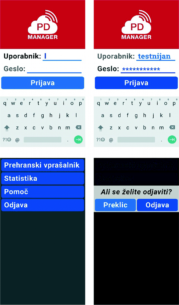
Login credentials and logout; testing with these screens revealed how troublesome can a basic interaction such as typing be for people with Parkinson’s. They suggested to have the keyboard layout always in landscape so that keys are spaced more abundantly and to have the option to see the password when typing as typos are more frequent.
(Username input and password input, confirm button;
menu selection, conform choice)
-
2.
Recording current meal with a picture (Fig. 2),
Fig. 2. 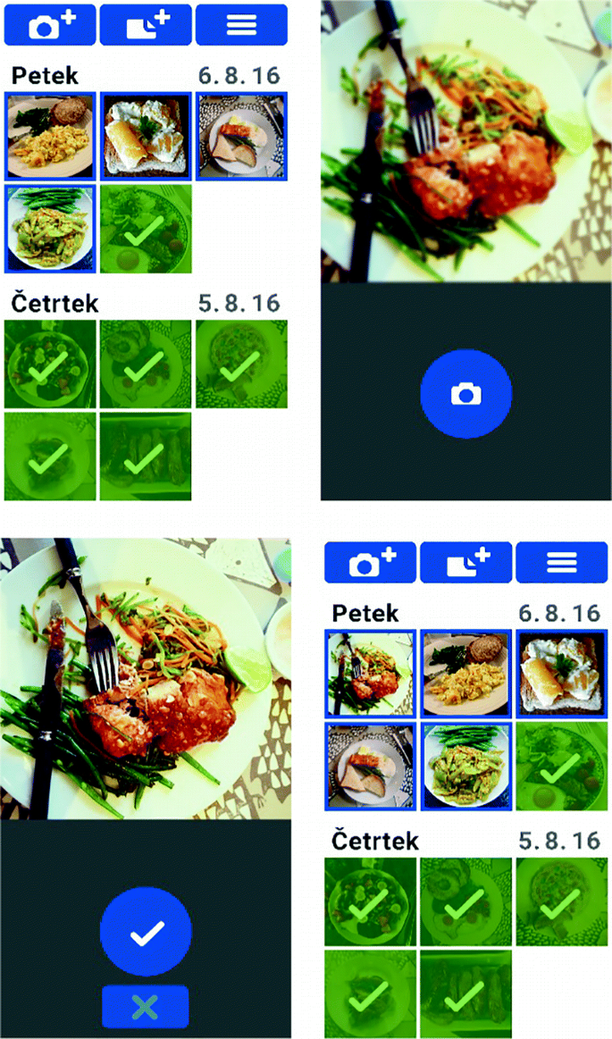
Recording current meal with a picture was mostly well understood and accepted by the participants.
(Menu select, picture take, button confirm, review collection)
-
3.
Editing previously entered meal (Fig. 3),
Fig. 3. 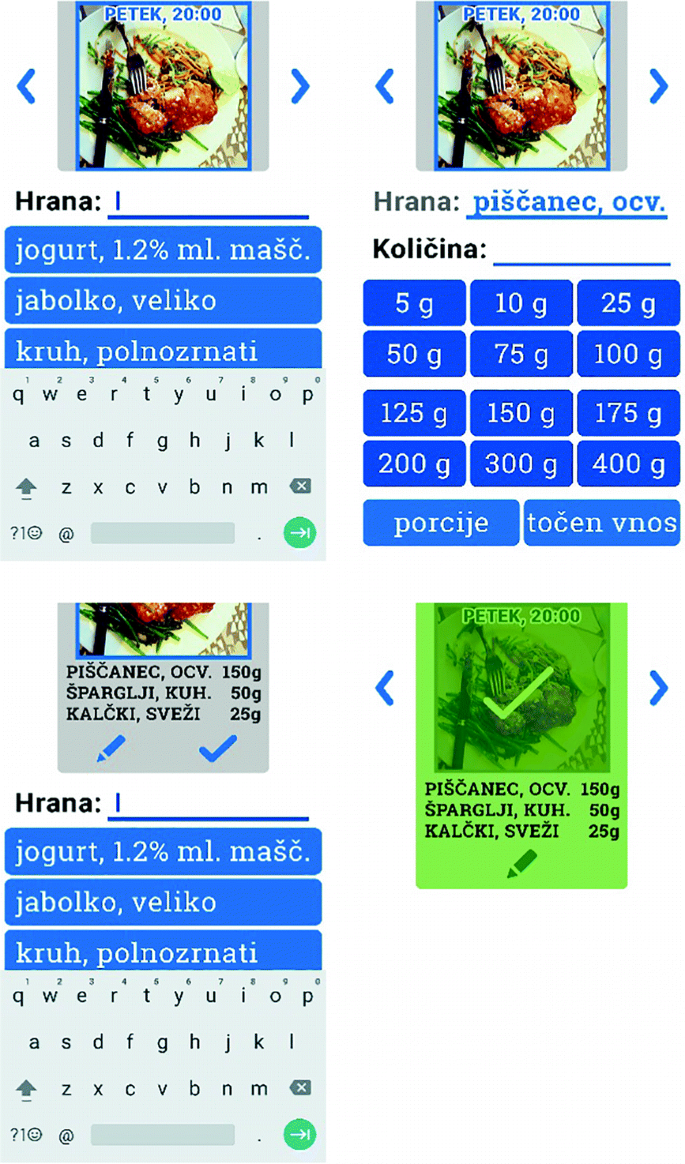
Editing previously entered meal. Participants appreciated the fact that most input and editing can be done via buttons thus minimizing the amount of typing needed.
(Food ingredient input, quantity input, confirm, repeat, confirm meal)
-
4.
Recording meal without picture (Fig. 4),
Fig. 4. 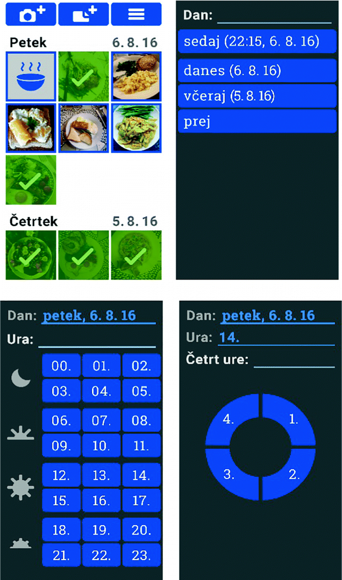
Recording meal without picture. The problem that appeared here was selecting the 14:15 time as it lies between the first and second quarters on the pictogram. Correcting the target area sensible for touch solved the current problem, but special attention must be paid to such details.
(day input, hour input, minutes input)


A post-test interview allowed the user to express his/her opinion and answer: what impression did you have using the app, were the elements in the app clear and readable, was it possible for you to normally press the elements, where they big enough, was the order of the screens understandable?
6 patients were recruited in the rehabilitation center Soča where the sessions were executed during scheduled visits. In general, users praised the application and accepted it well, however some issues emerged:
-
1.
Food input suggestion were not accurate as users would like (e.g. yoghurt 3.5% milk fat, suggested 1,2% milk fat from different brand).
-
2.
Patients felt the need to additionally confirm their input (misusing the arrow which is actually used to confirm the whole meal not just the ingredient).
-
3.
The meaning of the settings button (cog) was not clear.
-
4.
A patient did not consider scrolling at all.
-
5.
Entering time of meal - minutes was not intuitive.
-
6.
Default keyboard use should be in landscape mode to allow for more space between keys.
-
7.
The need to have a button making password visible during entering.
4 Conclusion
The work presented is a successful case-study of how to design interfaces for ICT solutions for a specific target group as people with Parkinson’s disease. Although the principles used to design the application build on general HCI and more specific accessibility literature, the value of the presented work lies in its specificity for PD patients – a growing and underserved population. Although based on a limited number of participants, to the best of our knowledge, this study is the only documented work on designing a nutrition diet monitoring and planning application specific for Parkinson’s patients.
References
Parkinson’s Disease Information Page. NINDS, 30 June 2016. http://www.ninds.nih.gov/disorders/parkinsons_disease/parkinsons_disease.htm
European Parkinson’s disease association. http://www.pdf.org/en/parkinson_statistics. Accessed Aug 2016
Cikajlo, I., et al.: Can telerehabilitation games lead to functional improvement of upper extremities in individuals with Parkinson’s disease?. Int. J. Rehabil. Res. (Internationale Zeitschrift fur Rehabilitationsforschung). Revue internationale de recherches de readaptation 41(3), 230 (2018)
Human Factors Approaches. Human Factors and Ageing Series, 2nd edn. CRC Press, New York
Moreno, L., Martínez, P.: A review of accessibility requirements in elderly users’ interactions with web applications. In: Proceedings of the 13th International Conference on Interacción Persona-Ordenador (INTERACCION 2012), Article 47, 2 p. ACM, New York (2012). https://doi.org/10.1145/2379636.2379682
Silva, P., Holden, K., Jordan, P.: Towards a list of heuristics to evaluate smartphone apps targeted at older adults: a study with apps that aim at promoting health and well-being. In: 2015 48th Hawaii International Conference on System Sciences (HICSS), pp. 3237–3246 (2015). https://doi.org/10.1109/hicss.2015.390
Motti, L.G., Vigouroux, N., Gorce, P.: Interaction techniques for older adults using touchscreen devices: a literature review. In: Proceedings of the 25th Conference on l’Interaction Homme-Machine (IHM 2013), p. 125, 10 p. ACM, New York (2013). https://doi.org/10.1145/2534903.2534920
Nunes, F., Silva, P.A., Cevada, J., Correia, B.A., Teixeira, L.: User interface design guidelines for smartphone applications for people with Parkinson’s disease. Univ. Access Inf. Soc. 15, 659–679 (2015). https://doi.org/10.1007/s10209-015-0440-1
Maziewski, P., Suchomski, P., Kostek, B., Czyzewski, A.: An intuitive graphical user interface for the Parkinson’s Disease patients. In: 2009 4th International IEEE/EMBS Conference on Neural Engineering, Antalya, pp. 14–17 (2009). https://doi.org/10.1109/ner.2009.5109223
Barros, A.C., Cevada, J., Bayés, À., Alcaine, S., Mestre, B.: Design and evaluation of a medication application for people with Parkinson’s disease. In: Mobile Computing, Applications, and Services: 5th International Conference, MobiCASE 2013, Paris, France, 7–8 November 2013, Revised Selected Papers, pp. 273–276 (2013). https://doi.org/10.1007/978-3-319-05452-0_22
McNaney, R., et al.: Designing for and with people with Parkinson’s: a focus on exergaming. In: Proceedings of the 33rd Annual ACM Conference on Human Factors in Computing Systems (CHI 2015), pp. 501–510. ACM, New York (2015). https://doi.org/10.1145/2702123.2702310
Assad, O., et al.: Motion-based games for Parkinson’s disease patients. In: Anacleto, J.C., Fels, S., Graham, N., Kapralos, B., Saif El-Nasr, M., Stanley, K. (eds.) ICEC 2011. LNCS, vol. 6972, pp. 47–58. Springer, Heidelberg (2011). https://doi.org/10.1007/978-3-642-24500-8_6
Barros, A.C., Cevada, J., Bayés, À., Alcaine, S., Mestre, B.: User-centred design of a mobile self-management solution for Parkinson’s disease. In: Proceedings of the 12th International Conference on Mobile and Ubiquitous Multimedia (MUM 2013), Article 23, 10 p. ACM, New York (2013). https://doi.org/10.1145/2541831.2541839
ISO 9241-11: Ergonomic requirements for office work with visual display terminals (VDTs), Part 11: Guidance on usability (1998)
Author information
Authors and Affiliations
Corresponding author
Editor information
Editors and Affiliations
Rights and permissions
Copyright information
© 2019 Springer Nature Switzerland AG
About this paper

Cite this paper
Blažica, B., Novak, P., Novak, F., Seljak, B.K. (2019). Design and Usability Evaluation of Interface of Mobile Application for Nutrition Tracking for People with Parkinson’s Disease. In: Duffy, V. (eds) Digital Human Modeling and Applications in Health, Safety, Ergonomics and Risk Management. Healthcare Applications. HCII 2019. Lecture Notes in Computer Science(), vol 11582. Springer, Cham. https://doi.org/10.1007/978-3-030-22219-2_15
Download citation
DOI: https://doi.org/10.1007/978-3-030-22219-2_15
Published:
Publisher Name: Springer, Cham
Print ISBN: 978-3-030-22218-5
Online ISBN: 978-3-030-22219-2
eBook Packages: Computer ScienceComputer Science (R0)